lm(y ~ poly(x, 3))               # orthogonal polynomial basis
lm(y ~ x + I(x^2) + I(x^3))      # raw powers
lm(y ~ poly(x, 3, raw = TRUE)) # also raw powers7 Feature Engineering
TipLearning objectives
After this lecture you should be able to
- explain why a model built from polynomials and interactions is still a linear model,
- construct these features and write the corresponding
lm()formula, - interpret a coefficient in each case, and explain why “a one-unit increase, holding all else constant” can stop making sense, and
- use an F-test to decide how much curvature, or whether an interaction, the data actually support.
7.1 Linear in the parameters
Multiple linear regression looks restrictive: a straight line in each explanatory variable. It is not. Consider
\[Y_i = \beta_0 + \beta_1 h_1(X_i) + \cdots + \beta_p h_p(X_i) + \epsilon_i\]
where \(X_i\) collects the explanatory variables recorded for observation \(i\) — the raw columns in the data — and \(h_1, \ldots, h_p\) are known, fixed functions of them, called basis functions. The value \(h_j(X_i)\) each one produces, not \(X_i\) itself, is the feature that actually enters the model as a column of the design matrix.
A feature is constructed from one or more explanatory variables through its basis function. Every model up to this lecture used the identity basis function on a single explanatory variable, \(h_j(X_i) = X_{ij}\), so feature and explanatory variable were the same thing and the distinction never mattered. This lecture is about the cases where \(h_j\) is not the identity: a polynomial term \(h_j(X_i) = X_{i1}^2\) is a feature built from one explanatory variable, and an interaction term \(h_j(X_i) = X_{i1}X_{i2}\) (below) is a feature built from two. From here on, explanatory variable means a column recorded in the data, and feature means whatever column actually enters the model — the two coincide only when \(h_j\) is the identity.
This model is linear in \(\beta\), which is all least squares ever required. Every result from last lecture therefore carries over unchanged: \(\hat\beta = (\mathbf{X}^\top \mathbf{X})^{-1}\mathbf{X}^\top y\), the t-tests, the F-tests, the intervals. Only the columns of the design matrix change.
Choosing the \(h_j\) is feature engineering, and it is where most of the modeling judgment in a regression analysis lives.
7.2 Polynomials
Use the powers of a single feature as the basis:
\[Y_i = \beta_0 + \beta_1 X_i + \beta_2 X_i^2 + \cdots + \beta_d X_i^d + \epsilon_i.\]
The fit is now a curve, and no single coefficient is “the effect of \(X\).” That effect is the derivative
\[\frac{\partial}{\partial x} E[Y|X = x] = \beta_1 + 2\beta_2 x + \cdots + d\beta_d x^{d-1},\]
which depends on where you are. Reporting \(\hat\beta_1\) by itself is meaningless.
Two cautions:
- Hierarchy: if \(X^2\) is in the model, keep \(X\).
- Extrapolation: high-degree polynomials behave badly outside the range of the data.
NoteWhy
poly() instead of raw powers?
Over a range like \(x \in [0,10]\), the columns \(x\), \(x^2\), and \(x^3\) are enormously correlated — they all increase together. That is collinearity, and it inflates standard errors and destabilizes \(\hat\beta\) numerically.
poly() builds an orthogonal basis spanning the same space, so \(\hat{y}\), the RSS, and \(R^2\) are identical. What changes is that the coefficients are now uncorrelated, so their t-tests can be read one at a time — a convenient way to ask “is the cubic term needed?”
7.2.1 Galileo’s falling bodies
Galileo released a ball from a ramp at seven different heights and measured how far it travelled horizontally. Physics says that relationship should be curved, so this is a natural place to ask how much curvature the data support.
Before fitting anything, look at the relationship itself:
NoteCode
m1 <- lm(Distance ~ Height,          data = Sleuth3::case1001)
m2 <- lm(Distance ~ poly(Height, 2), data = Sleuth3::case1001)
m3 <- lm(Distance ~ poly(Height, 3), data = Sleuth3::case1001)

model_levels    <- c("linear", "quadratic", "cubic")
model_colors    <- c(linear = "#E69F00", quadratic = "#56B4E9", cubic = "#009E73")
model_linetypes <- c(linear = "solid",   quadratic = "dashed",  cubic = "dotted")

galileo_grid <- tibble(Height = seq(100, 1000, length.out = 200))

galileo_pred <- bind_rows(
  galileo_grid |> mutate(Distance = predict(m1, galileo_grid), Model = "linear"),
  galileo_grid |> mutate(Distance = predict(m2, galileo_grid), Model = "quadratic"),
  galileo_grid |> mutate(Distance = predict(m3, galileo_grid), Model = "cubic")
)

# A shared base layer, so the four views below differ only in which lines
# (and legend rows) are layered on top of it. The color/linetype scales are
# attached separately below, only on the plots that actually map them --
# attaching an unused manual scale to the data-only plot triggers a spurious
# "no shared levels" warning from ggplot2.
galileo_base <- ggplot(Sleuth3::case1001, aes(x = Height, y = Distance)) +
  geom_point() +
  coord_cartesian(xlim = range(galileo_grid$Height),
                   ylim = range(Sleuth3::case1001$Distance, galileo_pred$Distance)) +
  labs(title = "Sleuth3::case1001", x = "Release height", y = "Horizontal distance") +
  # Legend drawn inside the panel, bottom right, so the panel itself is the
  # same size on every tab -- an outside legend would grow the plot's total
  # width as rows are added, shifting the panel between tabs.
  theme(legend.position = "inside",
        legend.position.inside = c(0.98, 0.02),
        legend.justification = c(1, 0),
        legend.background = element_rect(fill = alpha("white", 0.8), color = "grey70"))

galileo_data_plot <- galileo_base

galileo_linear_plot <- galileo_base +
  geom_line(
    data = galileo_pred |>
      filter(Model == "linear") |>
      mutate(Model = factor(Model, levels = "linear")),
    aes(color = Model, linetype = Model)
  ) +
  scale_color_manual(values = model_colors) +
  scale_linetype_manual(values = model_linetypes)

galileo_quadratic_plot <- galileo_base +
  geom_line(
    data = galileo_pred |>
      filter(Model %in% c("linear", "quadratic")) |>
      mutate(Model = factor(Model, levels = c("linear", "quadratic"))),
    aes(color = Model, linetype = Model)
  ) +
  scale_color_manual(values = model_colors) +
  scale_linetype_manual(values = model_linetypes)

galileo_cubic_plot <- galileo_base +
  geom_line(
    data = galileo_pred |> mutate(Model = factor(Model, levels = model_levels)),
    aes(color = Model, linetype = Model)
  ) +
  scale_color_manual(values = model_colors) +
  scale_linetype_manual(values = model_linetypes)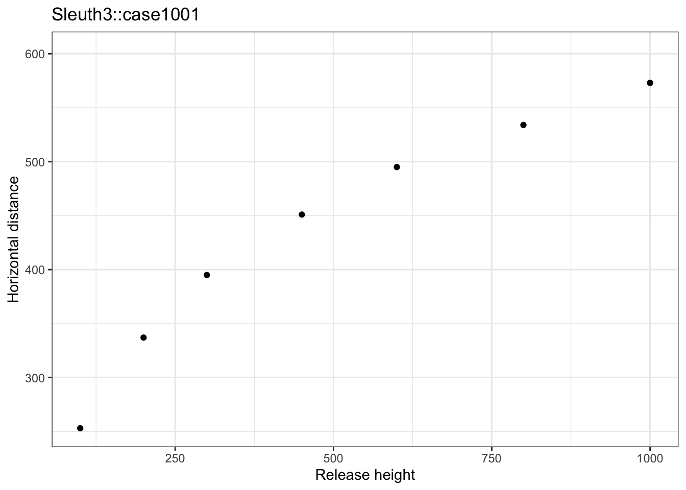
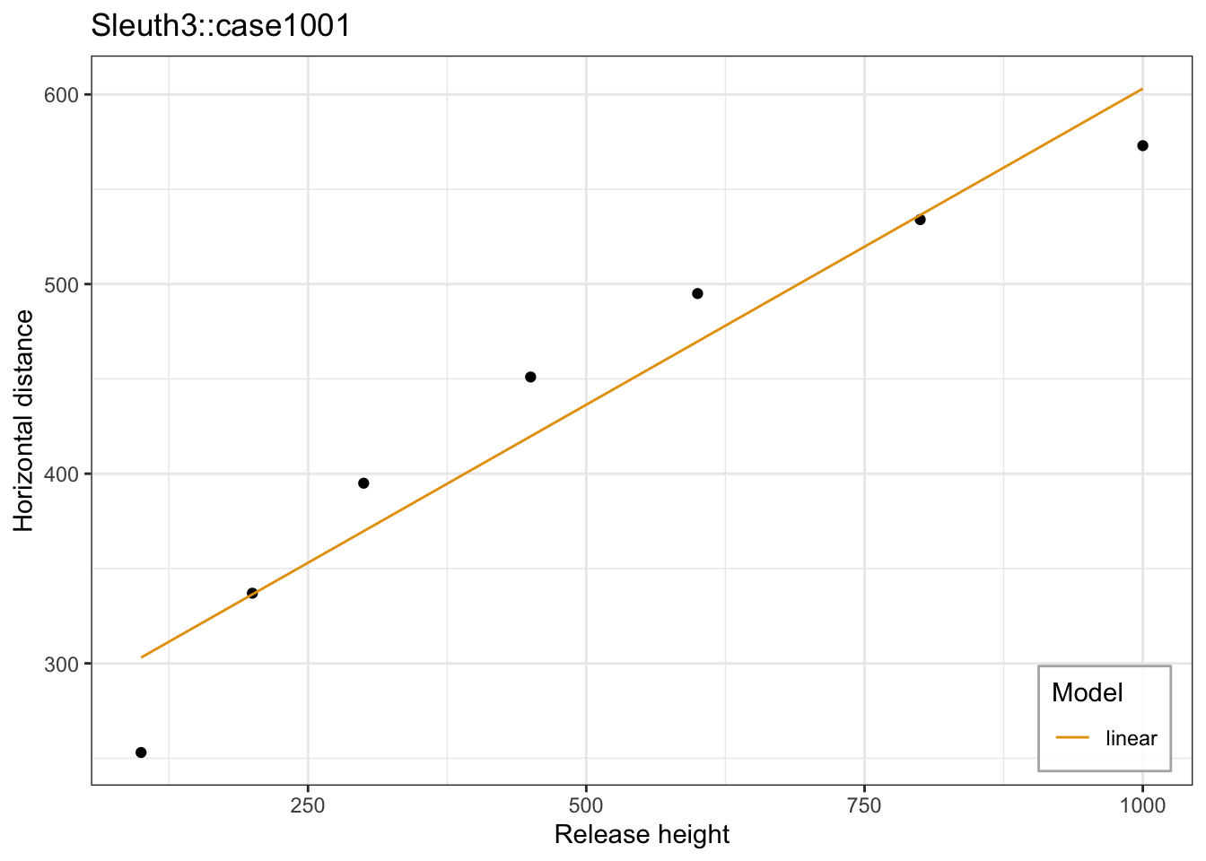
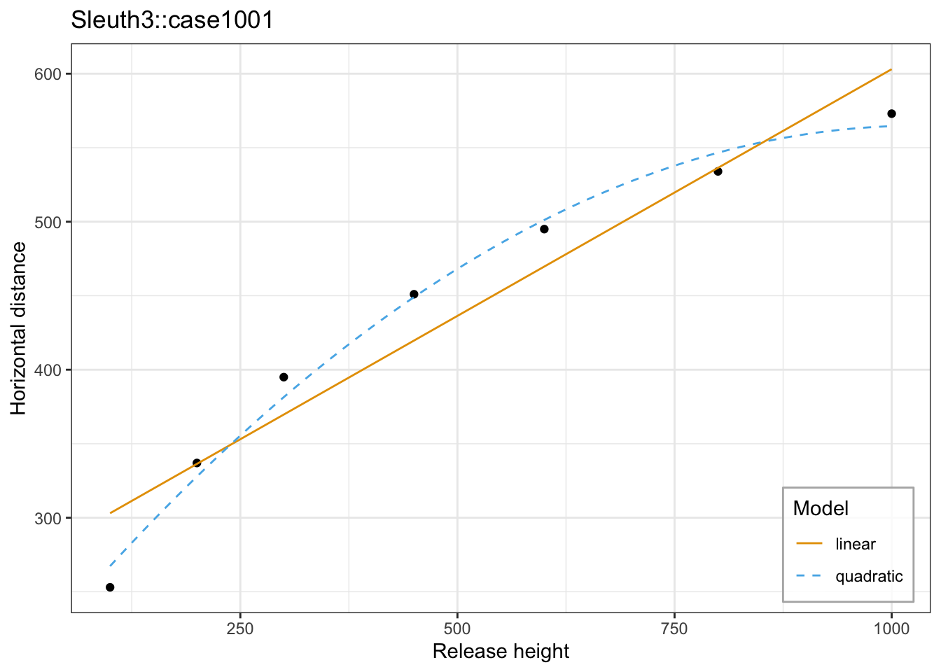
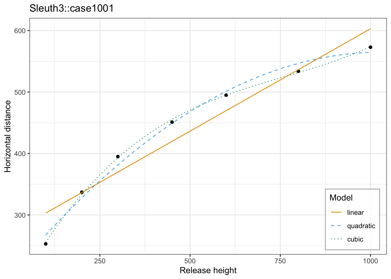
Click through the tabs: a line is added, and a row joins the legend, each time. Even by eye, the cubic barely bends past the quadratic — the question is whether that bend is worth the extra parameter.
Now fit the three models explicitly and compare them with a nested F-test:
m1 <- lm(Distance ~ Height,          data = Sleuth3::case1001)
m2 <- lm(Distance ~ poly(Height, 2), data = Sleuth3::case1001)
m3 <- lm(Distance ~ poly(Height, 3), data = Sleuth3::case1001)

galileo_anova <- anova(m1, m2, m3)
galileo_anova
Analysis of Variance Table
Model 1: Distance ~ Height
Model 2: Distance ~ poly(Height, 2)
Model 3: Distance ~ poly(Height, 3)
Res.Df RSS Df Sum of Sq F Pr(>F)
1 5 5671.2
2 4 744.1 1 4927.1 306.33 0.0004065 ***
3 3 48.3 1 695.8 43.26 0.0071503 **
---
Signif. codes: 0 '***' 0.001 '**' 0.01 '*' 0.05 '.' 0.1 ' ' 1Because each model is nested in the next, anova() reports a sequential F-test on each row, comparing that model to the one above it. With three models compared at once, every row’s F-test uses the residual degrees of freedom of the largest model, 3, in the denominator — not each row’s own Res.Df. Row 2 tests \(H_0: \beta_2 = 0\) and gives \(F = 306.33\) on \(1\) and \(3\) degrees of freedom — the quadratic term is clearly needed. Row 3 tests \(H_0: \beta_3 = 0\) and gives \(F = 43.26\), so the cubic term improves the fit as well. The residual sum of squares falls from \(5671\) to \(744\) to \(48\).
Be careful about what that second F-test has established. There are \(n = 7\) observations, and the cubic model spends \(4\) parameters on them, leaving \(3\) degrees of freedom — the cubic curve nearly interpolates the data. A significant F-test says the cubic fits the training data better than the quadratic. It does not say the cubic will predict a new release height better. Physics in a vacuum argues for a quadratic, but physics with air resistance can make a cubic a reasonable approximation too — statistical significance alone should not settle which curve to extrapolate with. We return to this distinction next lecture.
7.3 Interactions
Let the effect of one feature depend on another:
\[Y_i = \beta_0 + \beta_1 X_{i1} + \beta_2 X_{i2} + \beta_3 X_{i1}X_{i2} + \epsilon_i.\]
Collect the terms involving \(X_{i1}\):
\[Y_i = \underbrace{(\beta_0 + \beta_2 X_{i2})}_{\text{intercept on } X_1} + \underbrace{(\beta_1 + \beta_3 X_{i2})}_{\text{slope on } X_1} X_{i1} + \epsilon_i.\]
The slope on \(X_1\) is a function of the other feature. This is exactly where “holding all else constant” breaks: you cannot move \(X_1\) while holding \(X_1X_2\) fixed. And \(\beta_1\) is now the slope on \(X_1\) when \(X_2 = 0\), which may be a value \(X_2\) never takes — centering usually makes the main effects interpretable again.
lm(y ~ x1 * x2) # expands to x1 + x2 + x1:x2Hierarchy applies here too: keep \(X_1\) and \(X_2\) whenever \(X_1X_2\) is present, whatever their individual p-values say.
NoteFor example,
With \(D = 1\) for group B and \(0\) for group A,
\[Y_i = \beta_0 + \beta_1 X_i + \beta_2 D_i + \beta_3 X_i D_i + \epsilon_i\]
fits group A with intercept \(\beta_0\) and slope \(\beta_1\), and group B with intercept \(\beta_0 + \beta_2\) and slope \(\beta_1 + \beta_3\). Without the interaction, the groups are forced to share a slope (parallel lines). With it, \(H_0: \beta_3 = 0\) tests whether the slopes differ.
7.3.1 Meadowfoam, where the interaction is not needed
Twenty-four meadowfoam plots were grown at six light intensities, with the light begun either early or late. Does the timing change the slope on intensity, or only the intercept?
Before fitting anything, look at the relationship itself:
NoteCode
meadowfoam <- Sleuth3::case0901 |>
  mutate(Time = factor(Time, levels = 1:2, labels = c("Late", "Early")))

meadowfoam_single      <- lm(Flowers ~ Intensity,        data = meadowfoam)
meadowfoam_additive    <- lm(Flowers ~ Intensity + Time, data = meadowfoam)
meadowfoam_interaction <- lm(Flowers ~ Intensity * Time, data = meadowfoam)

meadowfoam_grid <- expand_grid(
  Intensity = seq(min(meadowfoam$Intensity), max(meadowfoam$Intensity), length.out = 100),
  Time = levels(meadowfoam$Time)
) |>
  mutate(Time = factor(Time, levels = levels(meadowfoam$Time)))

# A shared base layer, so the four views below differ only in which line(s)
# are layered on top of it -- the panel itself never changes size or shape.
meadowfoam_base <- ggplot(meadowfoam, aes(x = Intensity, y = Flowers)) +
  geom_point(aes(color = Time, shape = Time)) +
  coord_cartesian(xlim = range(meadowfoam$Intensity),
                   ylim = range(meadowfoam$Flowers)) +
  labs(title = "Sleuth3::case0901") +
  theme(legend.position = "inside",
        legend.position.inside = c(0.98, 0.98),
        legend.justification = c(1, 1),
        legend.background = element_rect(fill = alpha("white", 0.8), color = "grey70"))

meadowfoam_data_plot <- meadowfoam_base

meadowfoam_single_plot <- meadowfoam_base +
  geom_line(
    data = meadowfoam_grid |> mutate(Flowers = predict(meadowfoam_single, meadowfoam_grid)),
    linewidth = 1
  )

meadowfoam_additive_plot <- meadowfoam_base +
  geom_line(
    data = meadowfoam_grid |> mutate(Flowers = predict(meadowfoam_additive, meadowfoam_grid)),
    aes(color = Time, linetype = Time)
  )

meadowfoam_interaction_plot <- meadowfoam_base +
  geom_line(
    data = meadowfoam_grid |> mutate(Flowers = predict(meadowfoam_interaction, meadowfoam_grid)),
    aes(color = Time, linetype = Time)
  )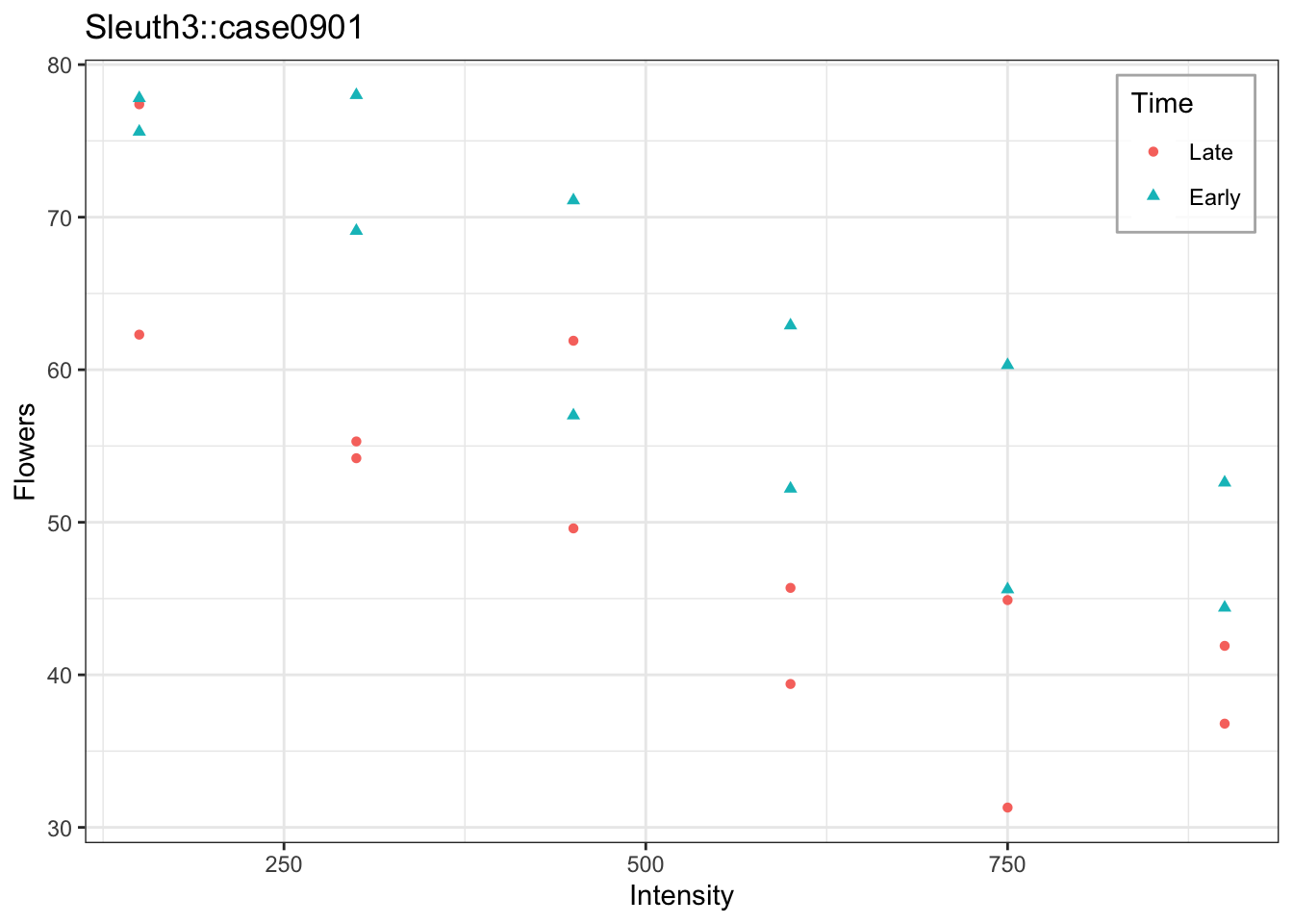
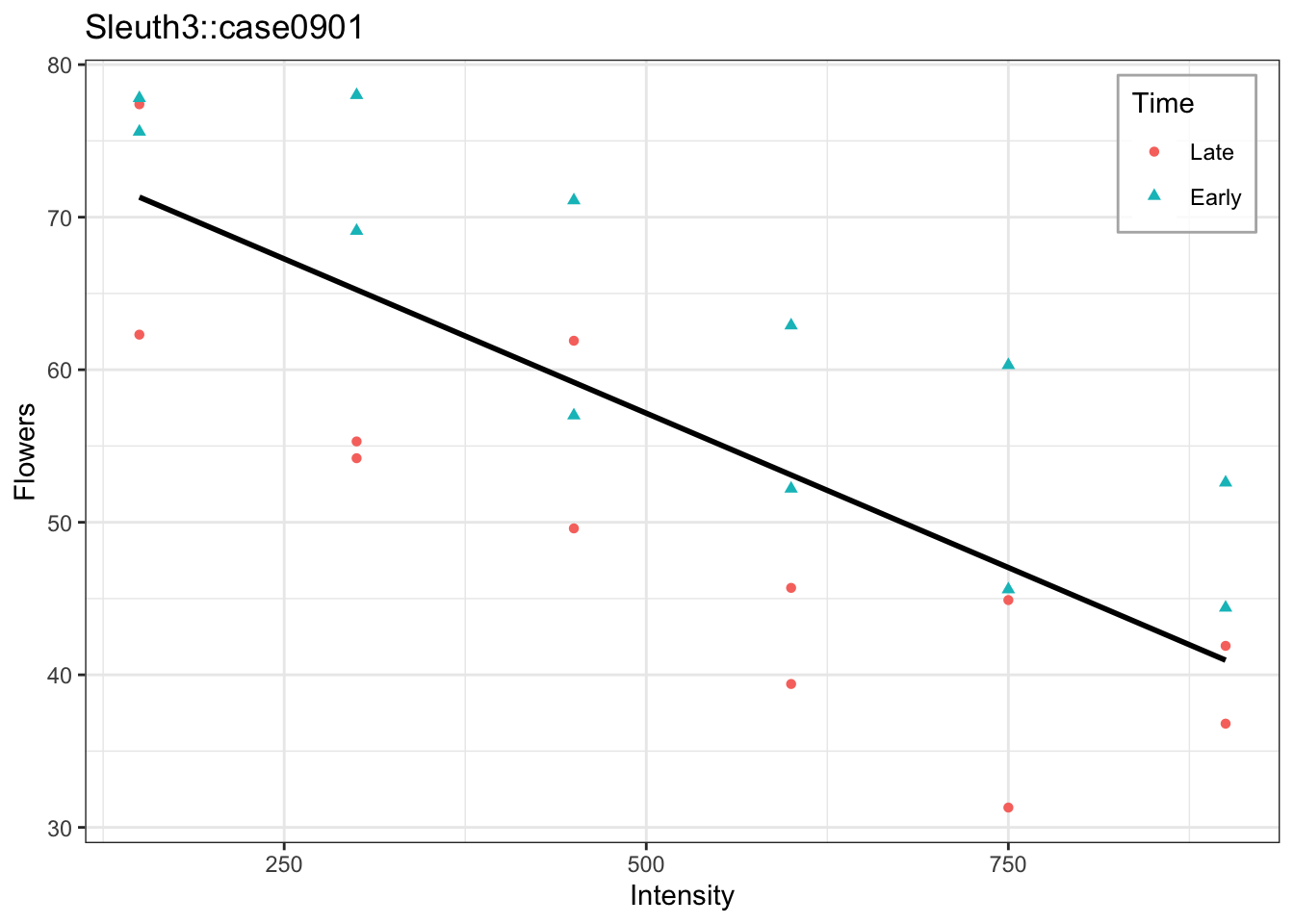
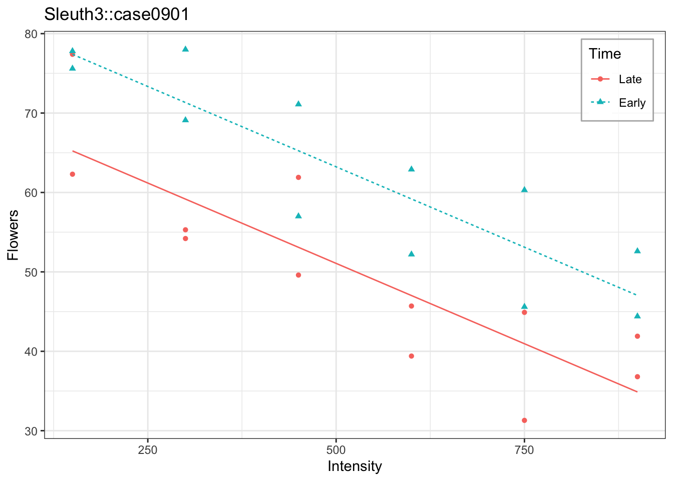
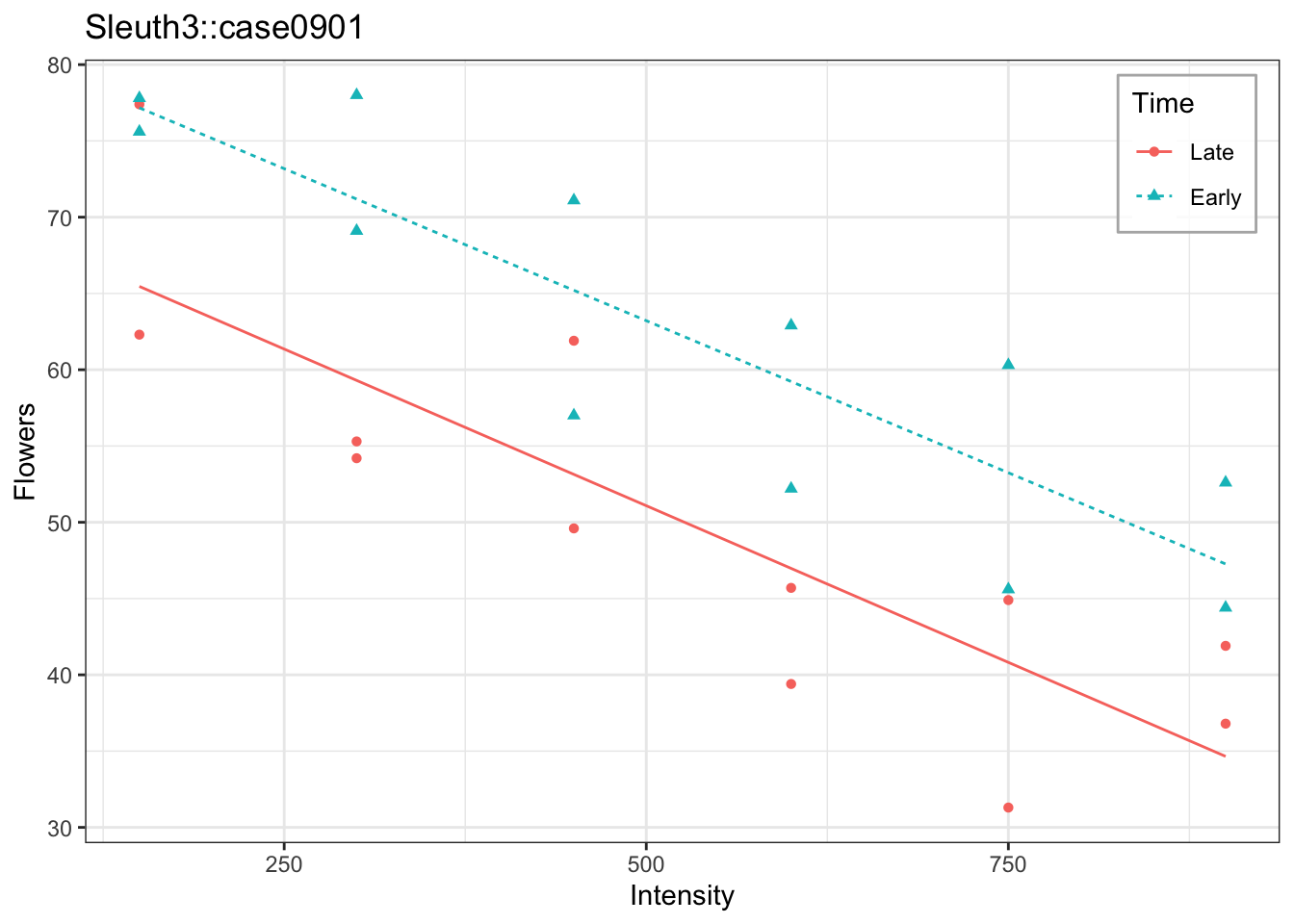
A single line, ignoring timing, is pulled between the two groups and fits neither well. The additive model gives each timing its own intercept but forces a common slope. The interaction model frees the slopes entirely — click through and notice how little that changes the fit here: the two slopes were already nearly identical without it.
Now fit the interaction model explicitly and test whether it earns its extra parameter:
meadowfoam_anova <- anova(meadowfoam_interaction)
meadowfoam_anova
Analysis of Variance Table
Response: Flowers
Df Sum Sq Mean Sq F value Pr(>F)
Intensity 1 2579.75 2579.75 59.2597 2.101e-07 ***
Time 1 886.95 886.95 20.3742 0.0002119 ***
Intensity:Time 1 0.58 0.58 0.0132 0.9095675
Residuals 20 870.66 43.53
---
Signif. codes: 0 '***' 0.001 '**' 0.01 '*' 0.05 '.' 0.1 ' ' 1The interaction gives \(F = 0.013\) on \(1\) and \(20\) degrees of freedom, so \(p = 0.91\). The two slopes are about as close as noisy data allow, and the test agrees: no evidence that the slope on intensity depends on timing. Drop the interaction and report the additive model, in which timing shifts the intercept by a constant amount and “the effect of intensity” is a single number again.
Dropping the interaction is fine. Dropping a main effect would not be.
7.3.2 Alcohol metabolism, where the interaction matters
Thirty-two subjects had their first-pass metabolism of alcohol measured along with the activity of gastric alcohol dehydrogenase, the enzyme that breaks alcohol down in the stomach.
Before fitting anything, look at the relationship itself:
NoteCode
noteworthy <- Sleuth3::case1101 |> filter(Subject %in% c(17, 31, 32))

metabolism_single      <- lm(Metabol ~ Gastric,        data = Sleuth3::case1101)
metabolism_additive    <- lm(Metabol ~ Gastric + Sex,  data = Sleuth3::case1101)
metabolism_interaction <- lm(Metabol ~ Gastric * Sex,  data = Sleuth3::case1101)

metabolism_grid <- expand_grid(
  Gastric = seq(min(Sleuth3::case1101$Gastric), max(Sleuth3::case1101$Gastric), length.out = 100),
  Sex = levels(Sleuth3::case1101$Sex)
) |>
  mutate(Sex = factor(Sex, levels = levels(Sleuth3::case1101$Sex)))

# A shared base layer, so the four views below differ only in which line(s)
# are layered on top of it -- the panel itself never changes size or shape.
metabolism_base <- ggplot(Sleuth3::case1101, aes(x = Gastric, y = Metabol)) +
  geom_point(aes(color = Sex, shape = Sex)) +
  geom_text(data = noteworthy, aes(label = Subject),
            hjust = -0.6, size = 3, show.legend = FALSE) +
  coord_cartesian(xlim = c(min(Sleuth3::case1101$Gastric), 5.6),
                   ylim = range(Sleuth3::case1101$Metabol)) +
  labs(title = "Sleuth3::case1101",
       x = "Gastric alcohol dehydrogenase activity",
       y = "First-pass metabolism") +
  theme(legend.position = "inside",
        legend.position.inside = c(0.02, 0.98),
        legend.justification = c(0, 1),
        legend.background = element_rect(fill = alpha("white", 0.8), color = "grey70"))

metabolism_data_plot <- metabolism_base

metabolism_single_plot <- metabolism_base +
  geom_line(
    data = metabolism_grid |> mutate(Metabol = predict(metabolism_single, metabolism_grid)),
    linewidth = 1
  )

metabolism_additive_plot <- metabolism_base +
  geom_line(
    data = metabolism_grid |> mutate(Metabol = predict(metabolism_additive, metabolism_grid)),
    aes(color = Sex, linetype = Sex)
  )

metabolism_interaction_plot <- metabolism_base +
  geom_line(
    data = metabolism_grid |> mutate(Metabol = predict(metabolism_interaction, metabolism_grid)),
    aes(color = Sex, linetype = Sex)
  )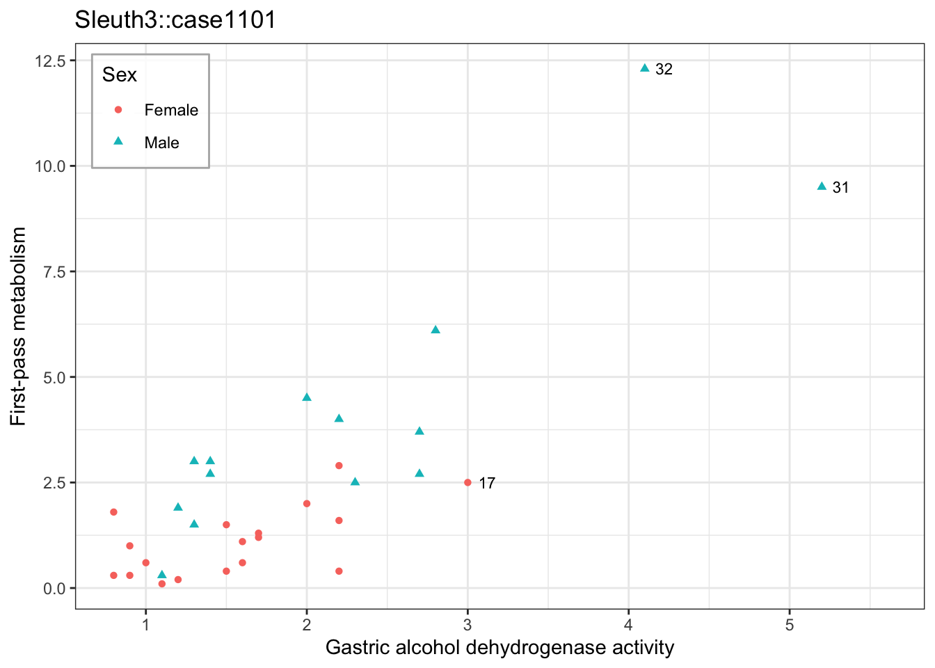
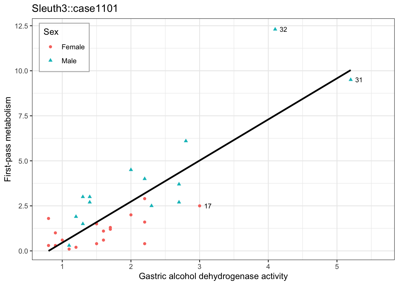
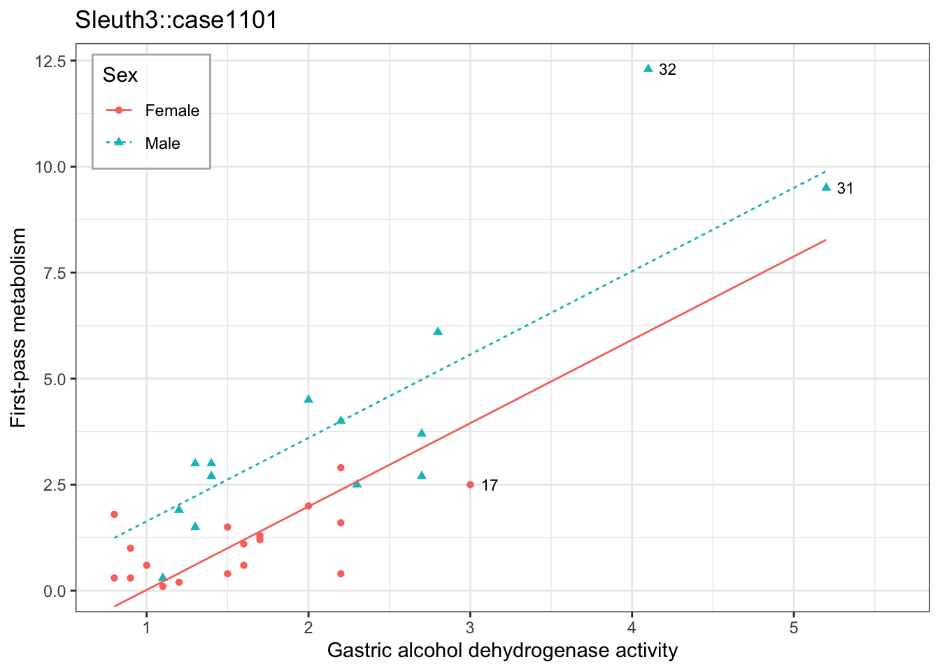
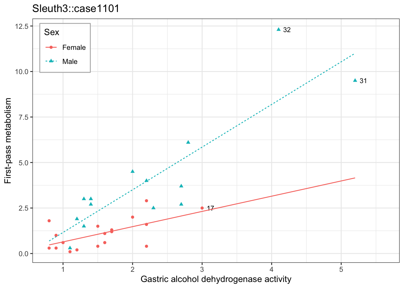
A single line, ignoring sex, cuts across both groups. The additive model gives each sex its own intercept but forces a common slope. The interaction model frees the slopes — and here, unlike meadowfoam, that visibly matters: the lines are far from parallel.
Now fit the interaction model explicitly and test whether it earns its extra parameter:
metabolism_anova <- anova(metabolism_interaction)
metabolism_anova
Analysis of Variance Table
Response: Metabol
Df Sum Sq Mean Sq F value Pr(>F)
Gastric 1 149.965 149.965 102.8855 7.025e-11 ***
Sex 1 17.729 17.729 12.1634 0.001628 **
Gastric:Sex 1 10.587 10.587 7.2635 0.011765 *
Residuals 28 40.813 1.458
---
Signif. codes: 0 '***' 0.001 '**' 0.01 '*' 0.05 '.' 0.1 ' ' 1coef(metabolism_interaction) (Intercept) Gastric SexMale Gastric:SexMale
-0.1972691 0.8369478 -0.9884969 1.5069236 Here the interaction gives \(F = 7.26\) on \(1\) and \(28\) degrees of freedom, so \(p = 0.012\), and the lines are visibly non-parallel. The fitted slope is \(0.84\) for females and \(0.84 + 1.51 = 2.34\) for males — nearly three times steeper.
In this model there is no such thing as “the effect of gastric activity.” There are two of them, and you have to say which sex you mean.
NoteA preview of a problem
Three observations are labeled by subject number in each plot above. Subjects 31 and 32 have gastric activity well beyond any other man’s, and subject 17 is the most extreme of the women. These are high-leverage points: they sit far from the bulk of the feature values, so they do a disproportionate share of the work in estimating the two slopes.
Notice that they are not all the same kind of unusual. Subject 31 sits close to the male line, while subject 32 is far above it. Next lecture we return to these three by number and separate leverage — an unusual feature value — from outliers, an unusual response.
7.4 Conclusion
Feature engineering keeps the model linear in \(\beta\) while letting the fitted curve be nonlinear in the explanatory variables: a polynomial or an interaction is just a choice of basis function \(h_j\), and choosing \(h_j\) only changes which columns enter the design matrix, not how \(\hat\beta\) is estimated or tested. Every result from ordinary least squares — the formula for \(\hat\beta\), the t-tests, the F-tests, the intervals — carries over unchanged.
A polynomial’s coefficients no longer have individual interpretations on their own; a feature’s effect on \(Y\) is a derivative that depends on where it is evaluated, which is why hierarchy (keeping a lower-degree term once a higher one is in the model) and caution about extrapolating past the observed range both matter. An interaction lets one feature’s effect depend on the value of another, and an F-test comparing the additive and interaction models is how you decide whether the data actually need that dependence rather than just eyeballing the fitted lines.
We picked the basis functions \(h_j\) by hand in both cases. Next lecture lets the data take over more of that choice — step functions and K-nearest neighbors — and then takes stock of what flexibility costs.