lm(wage ~ cut(age, breaks = c(18, 23, 30, 45, 65, 80),
right = FALSE, include.lowest = TRUE), data = Wage)8 Flexibility and Its Costs
TipLearning objectives
After this lecture you should be able to
- construct a step function model and explain why it is the dummy-variable machinery applied to a quantitative feature,
- describe K-nearest neighbors regression and identify \(1/K\) as its flexibility,
- compare a parametric fit against a nonparametric one and state the conditions under which each is preferable,
- diagnose the potential problems of ISLR2 Section 3.3.3 from a residual plot, leverage values, and variance inflation factors,
- distinguish a high-leverage point from an outlier, and use Cook’s distance to judge which observations actually influence the fit, and
- evaluate added flexibility in terms of the bias-variance tradeoff.
8.1 Step functions
Last lecture we used polynomials, which impose one global shape on the whole range of \(X\). A step function gives up smoothness instead. Choose cut points
\[-\infty = c_0 < c_1 < \cdots < c_p < c_{p+1} = \infty,\]
pinning the outer two at \(\pm\infty\) so the bins they define cover the entire range of \(X\), and define indicators
\[C_j(X) = \mathrm{I}(c_j \le X < c_{j+1}), \quad j = 1, \ldots, p.\]
Then fit
\[Y_i = \beta_0 + \beta_1 C_1(X_i) + \cdots + \beta_p C_p(X_i) + \epsilon_i,\]
leaving the first bin, \([c_0, c_1)\), as the reference. This is exactly the dummy-variable machinery from multiple regression — we have turned a quantitative feature into a categorical one — so the coefficients mean what they always mean for dummy variables:
- \(\beta_0\) is the mean of \(Y\) in the reference bin, and
- \(\beta_j\), for \(j = 1, \ldots, p\), is the mean of \(Y\) in the bin \([c_j, c_{j+1})\) minus the mean of \(Y\) in the reference bin.
Least squares makes the fitted value in every bin exactly that bin’s sample mean of \(y\), which is why these coefficients are differences between sample means.
8.1.1 Wages in age bins
Suppose we are interested in the relationship between age and wage. We have data from 3000 male workers in the Mid-Atlantic region (ISLR2::Wage), and we can compare how a step function fits that relationship against a straight line and a degree-5 polynomial.
NoteCode
age_cuts   <- c(18, 23, 30, 45, 65, 80)
age_labels <- c("18-23", "23-30", "30-45", "45-65", "65-80")

Wage <- Wage |>
  mutate(age_group = cut(age, age_cuts, right = FALSE, include.lowest = TRUE, labels = age_labels))

step_fit <- lm(wage ~ age_group, data = Wage)

age_grid <- tibble(age = seq(min(Wage$age), max(Wage$age), length.out = 400)) |>
  mutate(age_group = cut(age, age_cuts, right = FALSE, include.lowest = TRUE, labels = age_labels))

fit_grid <- function(model, label, binned = FALSE) {
  age_grid |>
    mutate(yhat = predict(model, age_grid),
           fit  = label,
           bin  = if (binned) as.character(age_group) else "all")
}

wage_pred <- bind_rows(
  fit_grid(lm(wage ~ age,          data = Wage), "Linear in age"),
  fit_grid(lm(wage ~ poly(age, 5), data = Wage), "Polynomial (degree 5)"),
  fit_grid(step_fit,                             "Step function (5 bins)", binned = TRUE)
) |>
  mutate(fit = fct_inorder(fit))

flexibility_plot <- ggplot(Wage, aes(x = age, y = wage)) +
  geom_point(alpha = 0.1) +
  geom_line(data = wage_pred, aes(y = yhat, group = interaction(fit, bin)),
            color = "blue", linewidth = 1) +
  facet_wrap(~ fit) +
  labs(title = "ISLR2::Wage")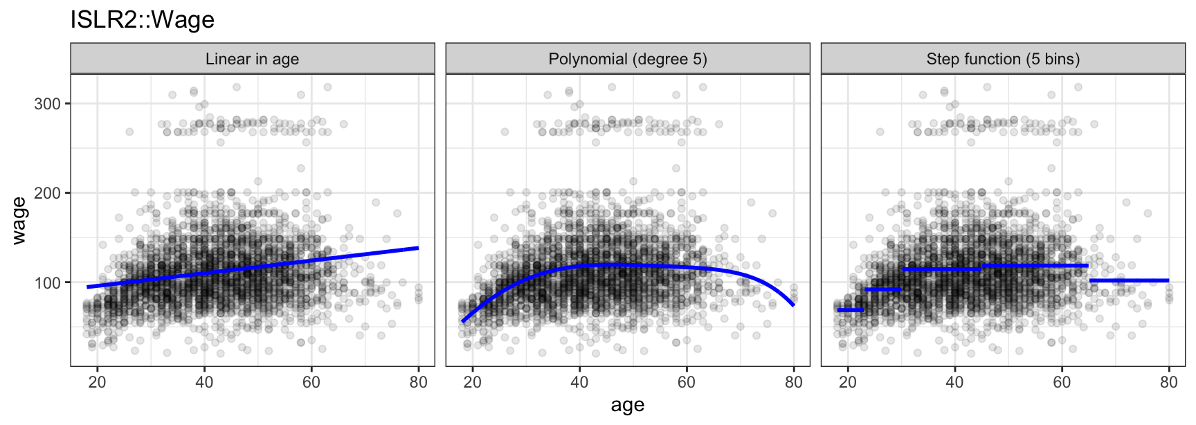
Wages are in thousands of dollars per year. The cut points above are not arbitrary — they follow a life-stage story anyone in this room can check against their own age: 18-23 is still finishing a degree, 23-30 is early career, 30-45 and 45-65 cover the years earnings typically build and peak, and 65-80 is whoever in this dataset is still working past a typical retirement age. (This is a male-only story, since Wage samples only male workers.)
The costs of the step function are visible on the right: the fit jumps at the cut points and ignores any trend within a bin. And we chose those cut points — nothing in the data told us where to put them.
Now look at what R actually estimated for that step function. Fitting on a named factor column, rather than a bare cut() call inside the formula, is what keeps the output readable:
coef(step_fit) (Intercept) age_group23-30 age_group30-45 age_group45-65 age_group65-80
68.67474 23.10838 45.83269 49.86252 33.12424 Four interior cut points — 23, 30, 45, and 65 — make five bins, but only four coefficients besides the intercept. The 18 and 80 in the code are not additional cut points; they just stand in for \(c_0 = -\infty\) and \(c_5 = \infty\), since no worker in the data falls outside them. The bin labeled 18-23 (that’s \((-\infty, c_1)\), which prints as 18-23 only because 18 happens to be the youngest worker in the data) has no \(C_j\) of its own. It is the reference bin, and everything about it is already inside \(\beta_0\):
NoteCode
b <- coef(step_fit)

step_table <- tibble(
  Bin                 = age_labels,
  Expression          = c("$\\hat\\beta_0$", paste0("$\\hat\\beta_0 + \\hat\\beta_", 1:4, "$")),
  `Value added`       = c("none", sprintf("%.1f", b[2:5])),
  `Bin mean, fitted`  = sprintf("%.1f", c(b[1], b[1] + b[2:5]))
) |>
knitr::kable(align = "lccc")| Bin | Expression | Value added | Bin mean, fitted |
|---|---|---|---|
| 18-23 | \(\hat\beta_0\) | none | 68.7 |
| 23-30 | \(\hat\beta_0 + \hat\beta_1\) | 23.1 | 91.8 |
| 30-45 | \(\hat\beta_0 + \hat\beta_2\) | 45.8 | 114.5 |
| 45-65 | \(\hat\beta_0 + \hat\beta_3\) | 49.9 | 118.5 |
| 65-80 | \(\hat\beta_0 + \hat\beta_4\) | 33.1 | 101.8 |
Read this row by row: \(\hat\beta_0 = 68.7\) is the mean wage of workers aged 18-23, the reference bin, exactly per the rule above — and every other row adds its coefficient to that reference. Workers aged 23-30 earn on average \(\hat\beta_0 + \hat\beta_1 = 68.7 + 23.1 = 91.8\). There is no coefficient at all for the reference bin, because \(X < c_1\) is exactly what happens when every \(C_j(X)\) is zero.
NoteBeyond this course
That last complaint is the whole idea behind regression trees (ISLR2 Chapter 8). A tree is a step function whose cut points are learned from the data, applied recursively and in several features at once — so a tree gets interactions for free, without our specifying them. A random forest averages many such step functions to cut their variance.
8.2 K-nearest neighbors regression
A step function lets the data choose the value taken in each bin, but we still chose the bins. K-nearest neighbors abandons fixed bins altogether and lets the neighborhood move with the point being predicted.
Fix a value \(K\) and a target point \(x_0\), and let \(\mathcal{N}_0\) be the set of the \(K\) training observations whose feature values are closest to \(x_0\). Then
\[\hat{f}(x_0) = \frac{1}{K} \sum_{i \in \mathcal{N}_0} y_i.\]
That is the whole method: average the responses of the nearest neighbors. There is no \(\beta\), nothing is fit by least squares, and no functional form is assumed anywhere. KNN is a nonparametric method, unlike every model we have seen so far.
knn_reg <- function(x0, x, y, K) {
  sapply(x0, function(z) mean(y[order(abs(x - z))[1:K]]))
}
\(K\) is the flexibility dial, and it runs backwards:
- \(K = 1\) makes \(\hat{f}\) follow a single observation at each point — zero training error when the feature values are all distinct, and enormous variance. (Here
ageis integer-valued and many workers share a value, so \(K = 1\) actually picks one of them arbitrarily rather than interpolating — worth checking against data before trusting the idealization.) - \(K = n\) makes \(\hat{f}\) the overall mean \(\bar{y}\), a flat line — maximum bias and minimum variance.
So it is \(1/K\) that plays the role of flexibility.
8.2.1 Wages in moving neighborhoods
The same age-and-wage data lets us see how \(K\) actually controls flexibility:
NoteCode
knn_pred <- map_df(c(1, 10, 50), function(K) {
  age_grid |>
    mutate(yhat = knn_reg(age, Wage$age, Wage$wage, K),
           K    = paste("K =", K))
}) |>
  mutate(K = factor(K, levels = paste("K =", c(1, 10, 50))))

knn_plot <- ggplot(Wage, aes(x = age, y = wage)) +
  geom_point(alpha = 0.1) +
  geom_line(data = knn_pred, aes(y = yhat), color = "blue", linewidth = 1) +
  facet_wrap(~ K) +
  labs(title = "ISLR2::Wage")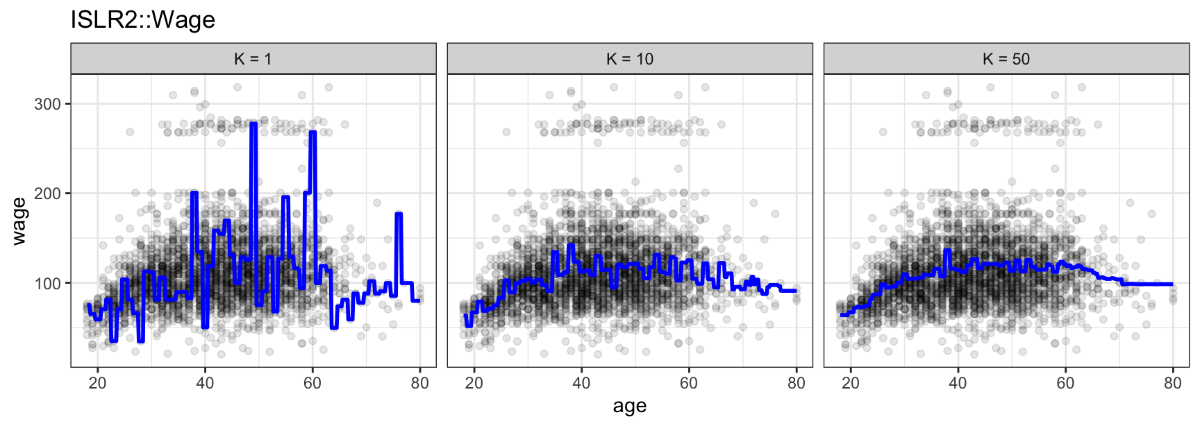
At \(K = 1\) the fit chases every tied observation and jumps around wildly; at \(K = 50\) it has smoothed into a single broad hump, not unlike the polynomial fit from the previous example. \(K = 10\) sits between the two.
8.2.2 KNN with more than one feature
Nothing about the method changes with \(p > 1\) features — only what “closest” means. With \(p\) features, \(\mathcal{N}_0\) becomes the \(K\) training points with the smallest Euclidean distance to \(x_0\) in \(p\)-dimensional space,
\[d(x_i, x_0) = \sqrt{\sum_{j=1}^p (x_{ij} - x_{0j})^2},\]
and because that distance depends on the scale of each feature, every feature should be standardized first, or a feature measured in thousands of dollars would dominate one measured in single digits regardless of which one actually predicts the response.
Two of ISLR2::Boston’s features work well for this: the percentage of the neighborhood that is lower-status (lstat) and the average number of rooms per home (rm), both used to predict median home value (medv). Before fitting anything, look at the relationship itself:
NoteCode
knn_reg_multi <- function(X0, X, y, K) {
  Xs  <- scale(X)
  X0s <- scale(X0, center = attr(Xs, "scaled:center"), scale = attr(Xs, "scaled:scale"))
  apply(X0s, 1, function(z) {
    d <- sqrt(rowSums((Xs - matrix(z, nrow(Xs), length(z), byrow = TRUE))^2))
    mean(y[order(d)[1:K]])
  })
}

knn_2d_grid <- expand_grid(
  lstat = seq(min(Boston$lstat), max(Boston$lstat), length.out = 60),
  rm    = seq(min(Boston$rm), max(Boston$rm), length.out = 60)
)

knn_2d_grid$medv_lstat <- knn_reg_multi(
  as.matrix(knn_2d_grid[, "lstat", drop = FALSE]),
  as.matrix(Boston[, "lstat", drop = FALSE]),
  Boston$medv, K = 10)

knn_2d_grid$medv_rm <- knn_reg_multi(
  as.matrix(knn_2d_grid[, "rm", drop = FALSE]),
  as.matrix(Boston[, "rm", drop = FALSE]),
  Boston$medv, K = 10)

knn_2d_grid$medv_both <- knn_reg_multi(
  as.matrix(knn_2d_grid[, c("lstat", "rm")]),
  as.matrix(Boston[, c("lstat", "rm")]),
  Boston$medv, K = 10)

# Same color scale on every tab, so only the surface itself changes.
medv_range <- range(Boston$medv, knn_2d_grid$medv_lstat,
                     knn_2d_grid$medv_rm, knn_2d_grid$medv_both)

# A shared base layer, so the four views below differ only in what's drawn
# over it -- the panel itself never changes size, shape, or color scale.
knn_2d_base <- ggplot(mapping = aes(x = lstat, y = rm)) +
  coord_cartesian(xlim = range(Boston$lstat), ylim = range(Boston$rm)) +
  labs(x = "Percent lower-status population (lstat)",
       y = "Average rooms per dwelling (rm)",
       title = "ISLR2::Boston") +
  theme(legend.position = "inside",
        legend.position.inside = c(0.98, 0.98),
        legend.justification = c(1, 1),
        legend.background = element_rect(fill = alpha("white", 0.8), color = "grey70"))

knn_2d_data_plot <- knn_2d_base +
  geom_point(data = Boston, aes(color = medv)) +
  scale_color_viridis_c(name = "medv", limits = medv_range)

knn_2d_lstat_plot <- knn_2d_base +
  geom_raster(data = knn_2d_grid, aes(fill = medv_lstat)) +
  geom_point(data = Boston, color = "white", alpha = 0.4, size = 0.6) +
  scale_fill_viridis_c(name = "medv", limits = medv_range)

knn_2d_rm_plot <- knn_2d_base +
  geom_raster(data = knn_2d_grid, aes(fill = medv_rm)) +
  geom_point(data = Boston, color = "white", alpha = 0.4, size = 0.6) +
  scale_fill_viridis_c(name = "medv", limits = medv_range)

knn_2d_both_plot <- knn_2d_base +
  geom_raster(data = knn_2d_grid, aes(fill = medv_both)) +
  geom_point(data = Boston, color = "white", alpha = 0.4, size = 0.6) +
  scale_fill_viridis_c(name = "medv", limits = medv_range)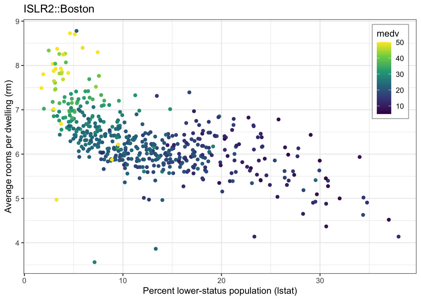
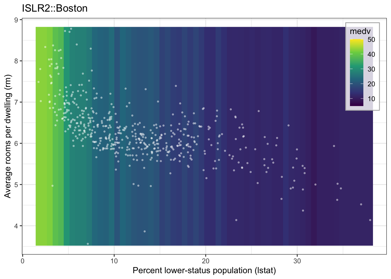
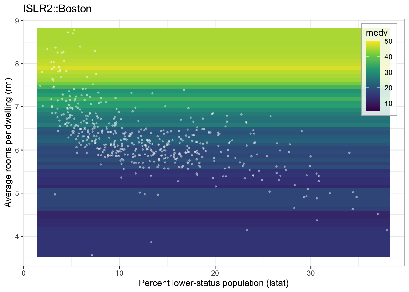
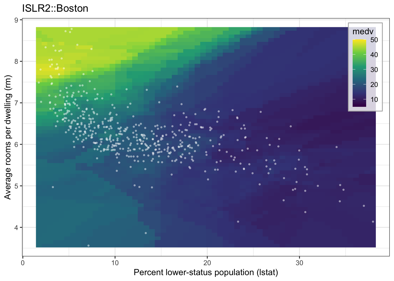
Click through the tabs: KNN on lstat alone varies only left to right, KNN on rm alone varies only bottom to top, and KNN on both varies in every direction at once — the fitted value genuinely depends on where \(x_0\) sits in the full two-dimensional feature space, not just its position on one axis.
8.2.3 When does KNN beat linear regression?
When the true \(f\) is far from linear, KNN wins, and it does so without our having to guess the right polynomial degree or the right cut points.
When \(f\) really is close to linear, least squares wins, because it estimates that line using every observation at once rather than only \(K\) of them.
The decisive issue is the number of features. As \(p\) grows, the \(K\) “nearest” neighbors of \(x_0\) stop being anywhere near it — in high dimensions everything is far from everything — so averaging their responses estimates \(f\) somewhere other than at \(x_0\), which is bias. This is the curse of dimensionality.
A parametric model that is merely approximately right will usually beat a nonparametric one when \(p\) is large relative to \(n\) — even when the true relationship is not linear, because the nonparametric method’s variance from having too few effective neighbors outweighs the parametric method’s bias from having the wrong functional form.
8.3 Potential problems
Last lecture’s feature engineering is the cure for the first of these and the cause of the last two.
- Non-linearity. Structure in a plot of residuals against fitted values means the model is missing systematic signal — the motivation for polynomials, step functions, and KNN alike.
- Correlated errors. Common with data over time or space. Standard errors come out too small, so you are more confident than you have earned.
- Non-constant variance. A funnel in the residual plot; often handled by transforming the response, \(\log Y\) or \(\sqrt{Y}\).
- Outliers. An unusual response. Inflates \(\hat\sigma^2\) and depresses \(R^2\) without necessarily moving the line.
- High-leverage points. An unusual feature value. These do move the line, and polynomials make it worse — an extreme \(x\) raised to the fifth power is an extraordinarily influential row.
- Collinearity. Features carrying nearly the same information. The data cannot separate their effects, so \(\text{SE}(\hat\beta_j)\) inflates and the t-test loses power: a coefficient can matter and still look “insignificant.” Polynomials and interactions create collinearity by construction.
NoteDetecting leverage and collinearity
Leverage is \(h_i\), the \(i\)th diagonal element of the hat matrix \(H = X(X^\top X)^{-1}X^\top\). It averages \((p+1)/n\), so values several times that deserve a look. Leverage depends only on the features — you can compute it before seeing a single response.
Studentized residuals rescale each residual by its own estimated standard deviation, which shrinks as leverage grows, so residuals at very different points on the design become comparable on one scale. A rough rule of thumb flags \(|{\text{value}}| > 3\) as an outlier worth a look.
Cook’s distance combines leverage with the size of the residual into a single number measuring how much the fitted values would move if an observation were deleted. Values near or above \(1\) warrant attention. In R, hatvalues(), rstudent(), and cooks.distance() compute all three.
Collinearity is measured by the variance inflation factor
\[\text{VIF}(\hat\beta_j) = \frac{1}{1 - R^2_{X_j | X_{-j}}}\]
where \(R^2_{X_j|X_{-j}}\) comes from regressing \(X_j\) on all other features. VIF is 1 under no collinearity; past 5 or 10 is commonly flagged. Remedies: drop one feature, combine them, center them, or — for polynomials — use poly().
Every one of these shows up in data we have already used this semester. Number 2 is the least visible, because most of our examples are not collected over time — but the CAPM demonstration, with weekly returns ordered by date, is exactly where you would worry about it.
8.3.1 Reading residuals: curvature and changing spread
A plot of residuals against fitted values diagnoses problems 1 and 3 at a glance. Both of our regressions from last lecture have something to confess.
NoteCode
galileo_lin <- lm(Distance ~ Height,          data = Sleuth3::case1001)
metabol_fit <- lm(Metabol  ~ Gastric * Sex,   data = Sleuth3::case1101)

residual_data <- bind_rows(
  tibble(fitted = fitted(galileo_lin), resid = residuals(galileo_lin),
         panel  = "Galileo, linear fit: curvature"),
  tibble(fitted = fitted(metabol_fit), resid = residuals(metabol_fit),
         panel  = "Metabolism: non-constant variance")
)

residual_plot <- ggplot(residual_data, aes(x = fitted, y = resid)) +
  geom_hline(yintercept = 0, linetype = "dashed", color = "grey40") +
  geom_point() +
  facet_wrap(~ panel, scales = "free") +
  labs(x = "Fitted value", y = "Residual")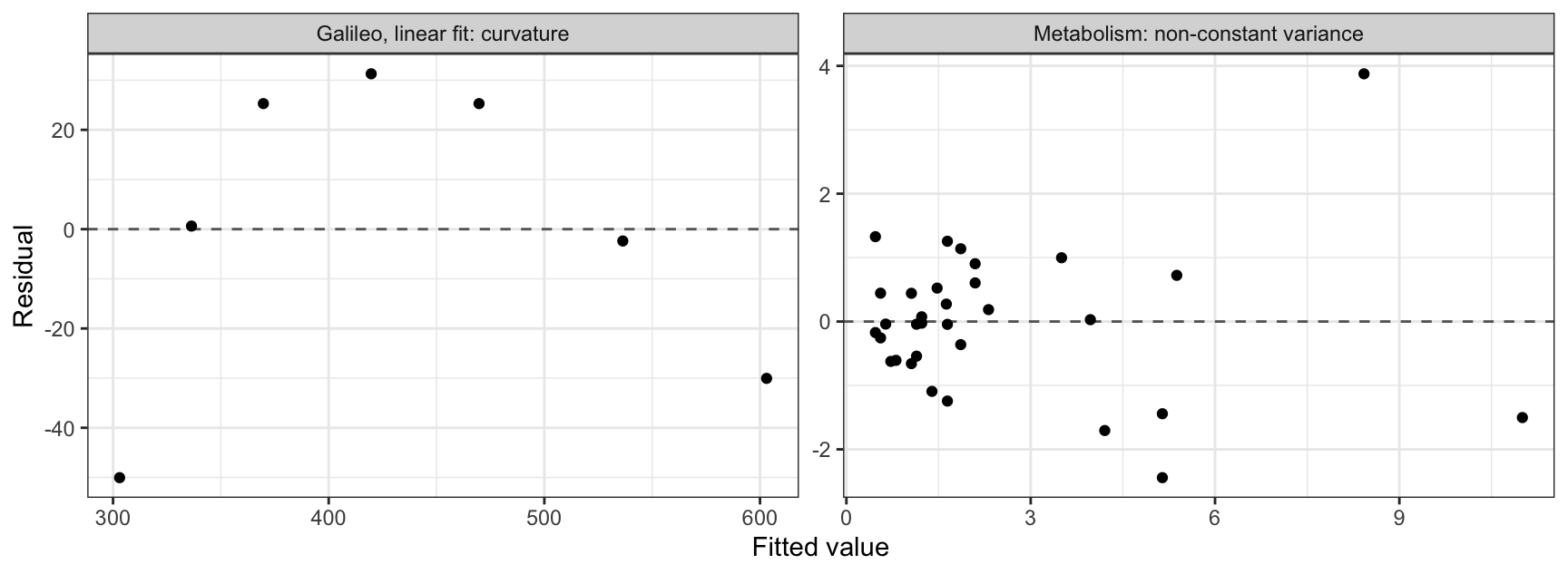
On the left, the residuals from the linear fit to Galileo’s data run negative, positive, then negative again — the inverted U that says a straight line is the wrong shape. That is problem 1, and it is precisely what the quadratic term fixed last lecture.
On the right, the residuals from the alcohol metabolism model fan out: near zero for small fitted values and spanning several units for large ones. That is problem 3. The constant-variance assumption behind every standard error in that output is not holding, and a \(\log\) or \(\sqrt{\cdot}\) transformation of the response would be the usual response.
8.3.2 Leverage and outliers are different things
Last lecture we labeled three subjects on the metabolism plot — 17, 31, and 32. Now we can be precise about them. With \(p + 1 = 4\) coefficients and \(n = 32\) observations, average leverage is \(4/32 = 0.125\).
NoteCode
average_leverage <- length(coef(metabol_fit)) / nrow(Sleuth3::case1101)

influence_data <- Sleuth3::case1101 |>
  mutate(leverage    = hatvalues(metabol_fit),
         studentized = rstudent(metabol_fit))

influence_plot <- ggplot(influence_data, aes(x = leverage, y = studentized)) +
  geom_hline(yintercept = c(-3, 3),            linetype = "dashed", color = "grey40") +
  geom_vline(xintercept = 2 * average_leverage, linetype = "dashed", color = "grey40") +
  geom_point() +
  geom_text(aes(label = ifelse(leverage > 2 * average_leverage | abs(studentized) > 3,
                               paste("Subject", Subject), "")),
            hjust = -0.15, size = 3) +
  expand_limits(x = 0.65) +
  labs(x = "Leverage", y = "Studentized residual")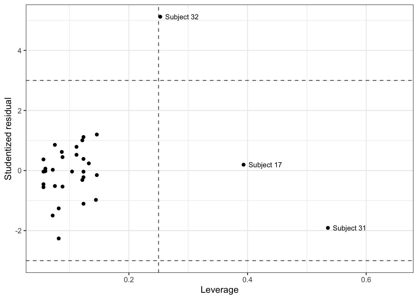
Three subjects sit outside the dashed guides, and they are outside for different reasons. Cook’s distance settles which of them actually matter.
NoteCode
influence_data_full <- tibble(
  Subject     = Sleuth3::case1101$Subject,
  Studentized = rstudent(metabol_fit),
  Leverage    = hatvalues(metabol_fit),
  CooksD      = cooks.distance(metabol_fit))

influence_table_data <- influence_data_full |>
  filter(Subject %in% c(17, 31, 32))

influence_table <- influence_table_data |>
  knitr::kable(digits = 3,
               col.names = c("Subject", "Studentized residual", "Leverage", "Cook's D"))

influence_of <- function(subject, column) {
  influence_table_data[[column]][influence_table_data$Subject == subject]
}| Subject | Studentized residual | Leverage | Cook’s D |
|---|---|---|---|
| 17 | 0.195 | 0.393 | 0.006 |
| 31 | -1.910 | 0.535 | 0.961 |
| 32 | 5.121 | 0.253 | 1.167 |
Cook’s distance answers a direct question: if we deleted this one observation and refit, how much would all the fitted values move? A large value means the model depends meaningfully on that single point.
It rises with both of the columns beside it. A point has to disagree with the model and have room to pull the line toward itself before it can do real damage — and having room is exactly what leverage measures. Either ingredient alone is harmless; the combination is not.
The table makes the distinction concrete. Subject 17 has leverage \(0.393\), more than three times the average of \(4/32 = 0.125\), and yet Cook’s distance is \(0.006\). It sits far from the other feature values and agrees completely with the trend, so deleting it would change essentially nothing. High leverage by itself is not a problem.
Subjects 31 and 32 both land near or above \(1\), the conventional cutoff, and they get there by opposite routes. Subject 32 has only moderate leverage but a studentized residual of \(5.12\) — it disagrees violently. Subject 31 has the largest leverage in the data (0.535) with an unremarkable residual of \(-1.91\) — it barely disagrees, but it has so much room that a small disagreement is enough.
Deleting either one would visibly move the male line, which is worth knowing before reporting that men metabolize alcohol at three times the female rate.
8.3.3 Collinearity you create yourself
Last lecture’s poly() callout claimed that raw powers are dangerously correlated. Galileo’s data lets us put a number on it.
vif <- function(X) {
  sapply(seq_along(X), function(j)
    1 / (1 - summary(lm(X[[j]] ~ ., data = X[-j]))$r.squared))
}

Height     <- Sleuth3::case1001$Height
raw_powers <- data.frame(Height = Height, Height2 = Height^2, Height3 = Height^3)
raw_power_vif <- vif(raw_powers)

round(raw_power_vif, 1)
[1] 172.2 960.3 356.2round(vif(as.data.frame(poly(Height, 3))), 3)[1] 1 1 1The raw powers carry variance inflation factors of roughly \(172\), \(960\), and \(356\) — the standard errors on those coefficients are inflated by factors of \(\sqrt{960} \approx 31\). The orthogonal basis from poly() gives exactly \(1\), \(1\), and \(1\).
The VIFs are a symptom; the correlation between the columns themselves is the cause. Plotting the first two terms of each basis against each other makes it visible directly:
NoteCode
poly_basis <- poly(Height, 3)

raw_cor  <- cor(Height, Height^2)
orth_cor <- cor(poly_basis[, 1], poly_basis[, 2])

collinearity_compare <- bind_rows(
  tibble(term1 = Height,          term2 = Height^2,
         basis = sprintf("Raw powers: Height vs Height^2 (r = %.2f)", raw_cor)),
  tibble(term1 = poly_basis[, 1], term2 = poly_basis[, 2],
         basis = sprintf("Orthogonal basis: term 1 vs term 2 (r = %.2f)", orth_cor))
) |>
  mutate(basis = fct_inorder(basis))

collinearity_plot <- ggplot(collinearity_compare, aes(x = term1, y = term2)) +
  geom_point() +
  facet_wrap(~ basis, scales = "free") +
  labs(x = "First term in the basis", y = "Second term in the basis",
       title = "Sleuth3::case1001")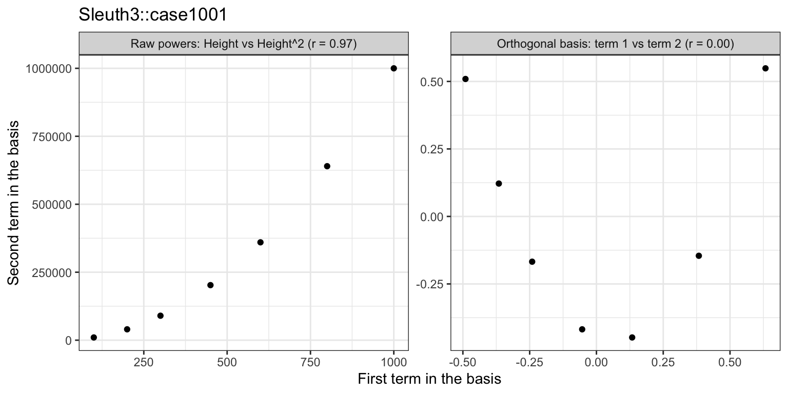
The raw powers trace a near-perfect curve — knowing Height tells you almost everything about Height^2 — while the orthogonal terms scatter with no visible pattern at all. That is what a VIF of \(1\) looks like: the two columns are exactly uncorrelated by construction.
Both parameterizations produce identical fitted values, residuals, and \(R^2\). Nothing about the quality of the fit changed. What changed is whether the individual coefficients can be interpreted and tested one at a time — and this is collinearity we manufactured ourselves by choosing a basis, not a defect in Galileo’s measurements.
8.3.4 Why not just look at the data?
Every problem in this section could have been caught by eye: 7 observations of Galileo’s, 32 subjects, one or two features — plot the data and you can see the curvature, see the two men stranded out on the right, see the spread widening.
That is about to stop being true. From here on the course adds features faster than you can plot them and models whose fitted surface cannot be drawn at all. There is no scatterplot of a random forest on twenty features, and no way to squint at observation 4,812 of 50,000 to decide whether it is dragging the fit.
What survives the transition is the numbers. Leverage, studentized residuals, Cook’s distance, and variance inflation factors are defined for any number of features, and they can be sorted, thresholded, and scanned without a human looking at anything. So can the diagnostic plots we just used: residuals against fitted values, or leverage against studentized residual, stay two-dimensional no matter how large \(p\) gets, because they plot model output rather than the data itself.
The habit worth building now, while you can still check the answer by looking, is to compute the diagnostic anyway and learn what its values mean. Later the number is all you will have.
8.4 Conclusion
Every feature you add to \(\mathbf{X}\), and every reduction in the number of neighbors \(K\), is another turn of the flexibility dial from ISLR2 Chapter 2. The training RSS can only fall as you turn it; the test MSE need not, because you are trading bias for variance.
So these methods hand us more candidate models than we can judge by eye, and training error cannot referee among them. Honest test-error estimates come from resampling (ISLR2 Chapter 5), and automatic ways to choose which features to keep come from selection and regularization (ISLR2 Chapter 6).