# default01 and default_jit are used by figures throughout this lecture, so
# both columns are added here, at the first figure that needs either. The
# jitter is drawn once into a column rather than left to geom_jitter(), which
# would re-randomize every time a tab is drawn and make the same points land
# in different places from one tab to the next.
Default <- Default |>
  mutate(balance_cat = factor(ifelse(balance > 1500, "High", "Low"),
                              levels = c("Low", "High")),
         default01 = as.numeric(default == "Yes"),
         default_jit = default01 + runif(n(), -0.03, 0.03))

cat_add        <- glm(default ~ balance_cat + student, data = Default,
                      family = "binomial")
balance_cat_glm <- glm(default ~ balance_cat * student, data = Default,
                       family = "binomial")

cat_cells <- expand_grid(
  balance_cat = factor(c("Low", "High"), levels = c("Low", "High")),
  student     = factor(c("No", "Yes"), levels = levels(Default$student)))

cat_obs <- Default |>
  group_by(balance_cat, student) |>
  summarize(rate = mean(default01), .groups = "drop") |>
  mutate(eta = log(rate / (1 - rate)))

cat_fit <- bind_rows(
  cat_cells |> mutate(Model = "Additive",
                      eta = predict(cat_add, newdata = cat_cells)),
  cat_cells |> mutate(Model = "Interaction",
                      eta = predict(balance_cat_glm, newdata = cat_cells))) |>
  mutate(p_hat = plogis(eta))

cat_x <- scale_x_discrete(labels = c(Low = "Up to $1,500",
                                     High = "Above $1,500"))

# The same shared-base idea used throughout this lecture: one base layer
# carrying the observed cells, with each tab adding only its own fit. One
# line per student group joins that group's two balance categories, so a
# model's student effect is the vertical gap between the two lines.
cat_base <- ggplot(mapping = aes(x = balance_cat, color = student,
                                 shape = student, linetype = student,
                                 group = student)) +
  cat_x +
  scale_color_manual(values = c("#0072B2", "#D55E00")) +
  labs(x = "Credit card balance", color = "Student", shape = "Student",
       linetype = "Student", title = "ISLR2::Default")

cat_link_base <- cat_base +
  geom_point(data = cat_obs, aes(y = eta), size = 3) +
  coord_cartesian(ylim = range(c(cat_obs$eta, cat_fit$eta))) +
  labs(y = expression(hat(eta)))

cat_prob_base <- cat_base +
  geom_point(data = cat_obs, aes(y = rate), size = 3) +
  coord_cartesian(ylim = c(0, 1)) +
  scale_y_continuous(breaks = c(0, 0.5, 1)) +
  labs(y = "P(default = Yes)")

cat_link_data        <- cat_link_base
cat_link_additive    <- cat_link_base +
  geom_line(data = filter(cat_fit, Model == "Additive"), aes(y = eta),
            linewidth = 0.9)
cat_link_interaction <- cat_link_base +
  geom_line(data = filter(cat_fit, Model == "Interaction"), aes(y = eta),
            linewidth = 0.9)

cat_prob_data        <- cat_prob_base
cat_prob_additive    <- cat_prob_base +
  geom_line(data = filter(cat_fit, Model == "Additive"), aes(y = p_hat),
            linewidth = 0.9)
cat_prob_interaction <- cat_prob_base +
  geom_line(data = filter(cat_fit, Model == "Interaction"), aes(y = p_hat),
linewidth = 0.9)11 Flexible Logistic Regression
TipLearning objectives
After this lecture you should be able to
- explain how interactions, polynomials, and step functions all enter logistic regression as basis-function columns of the linear predictor, and interpret a coefficient on any such column as a change in log-odds,
- distinguish categorical-categorical, continuous-categorical, and continuous-continuous interactions, and explain why a coefficient’s raw magnitude does not by itself indicate whether an interaction matters,
- write a logistic regression model with an interaction between a quantitative feature and an indicator, derive the two group-specific log-odds slopes \(\beta_1\) and \(\beta_1 + \beta_3\), and interpret \(e^{\beta_1}\) and \(e^{\beta_1 + \beta_3}\) as group-specific odds ratios,
- compare an additive fit against an interaction fit on the linear-predictor scale, where the additive model forces two parallel lines, and translate that comparison onto the probability scale and the decision boundary,
- test a single interaction coefficient with a \(z\)-statistic and several at once with a drop-in-deviance test, recognizing that a plausible interaction often turns out not to be, and
- describe how raising a polynomial’s degree adds curvature to the linear predictor, and, from a picture, how a fitted curve changes as a step function’s number of bins increases.
Additive logistic regression gives each feature its own term in the linear predictor and assumes nothing else. Three ways to relax that assumption carry over from linear regression unchanged: interactions, which let one feature’s effect depend on another feature’s value; polynomials, which let a single feature’s effect curve instead of running straight; and step functions, which let a single feature’s effect jump between bins instead of following any smooth curve at all.
Each of these is a choice of basis function \(h_j(X)\) from the feature engineering lecture — a squared term, a product of two features, an indicator for a range of \(X\) — entering the linear predictor as its own column,
\[\eta = \beta_0 + \beta_1 h_1(X) + \beta_2 h_2(X) + \cdots.\]
Logistic regression changes only what happens to \(\eta\) next: \(p(X) = \text{logistic}(\eta)\) in place of \(E[Y \mid X] = \eta\), and \(\hat\beta\) maximizes the Bernoulli log-likelihood in place of minimizing a sum of squared residuals. Every coefficient is still read the way earlier lectures read it — \(\beta_j\) a change in log-odds per unit of \(h_j(X)\) with every other column held fixed, \(e^{\beta_j}\) the corresponding odds ratio — whatever \(h_j\) turns out to be. That “held fixed” is worth flagging now: it breaks down whenever two columns move together, which is exactly what happens for \(X\) and \(X^2\), or for \(X\) and \(XD\), so it will need qualifying again once those columns appear below. What changes from one choice of \(h_j\) to the next is only what a “one-unit change” of it means.
This lecture works through interactions first, since they raise the most that is genuinely new, then polynomials and step functions more briefly, since the transfer is mostly mechanical.
11.1 Interactions
11.1.1 Additive assumption
The previous lecture’s model was additive: each feature contributed its own term \(\beta_j X_{ij}\) to the linear predictor, and no term involved two features at once. That structure is what licensed the interpretation “a one-unit increase in \(X_j\) multiplies the odds by \(e^{\beta_j}\), holding every other feature fixed” — the same \(e^{\beta_j}\) at every value of every other feature.
That is an assumption, not a convenience. The fitted curves of the previous lecture showed it directly: two curves of identical shape, separated by a constant \(\hat\beta_2\) on the log-odds scale at every balance.
There is no reason a real process has to work that way. Whether it does is a question about the data, and it can be asked and answered with a model that does not impose it. What that model looks like depends on whether the two interacting features are categorical or quantitative.
11.1.2 Categorical-categorical interactions
When both features are categorical, an interaction adds one indicator for every combination of their non-reference levels beyond what the two main effects already supply. With indicators \(D_1\) and \(D_2\) for two binary features,
\[\eta = \beta_0 + \beta_1 D_1 + \beta_2 D_2 + \beta_3 D_1 D_2,\]
and the product \(D_1 D_2\) is \(1\) only when an observation is at the non-reference level of both features, so \(\beta_3\) is the extra log-odds a case gets from being at both non-reference levels at once, beyond what \(\beta_1\) and \(\beta_2\) already give it separately.
A quantitative explanatory variable becomes categorical the same way it did in the flexibility lecture: pick a cutoff and take an indicator. Splitting balance at $1,500 turns the running Default example into a categorical-categorical case, balance_cat * student, with four balance-by-student cells to describe. The additive model spends three coefficients on them and forces a single student effect to serve at both balance levels; the interaction model spends four, one per cell.
Both fits are drawn below against the four observed cells, on the log-odds scale at left and the probability scale at right.
NoteCode
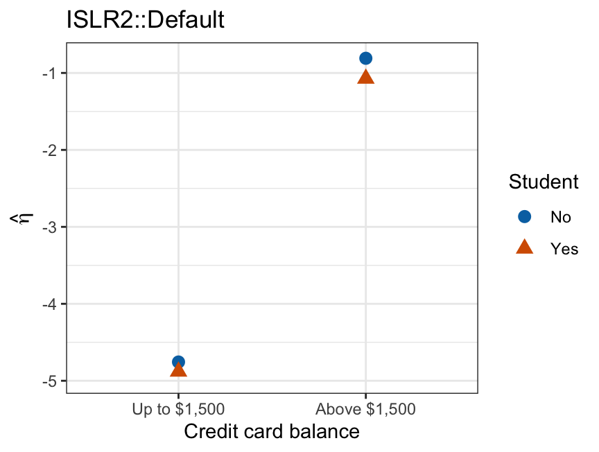
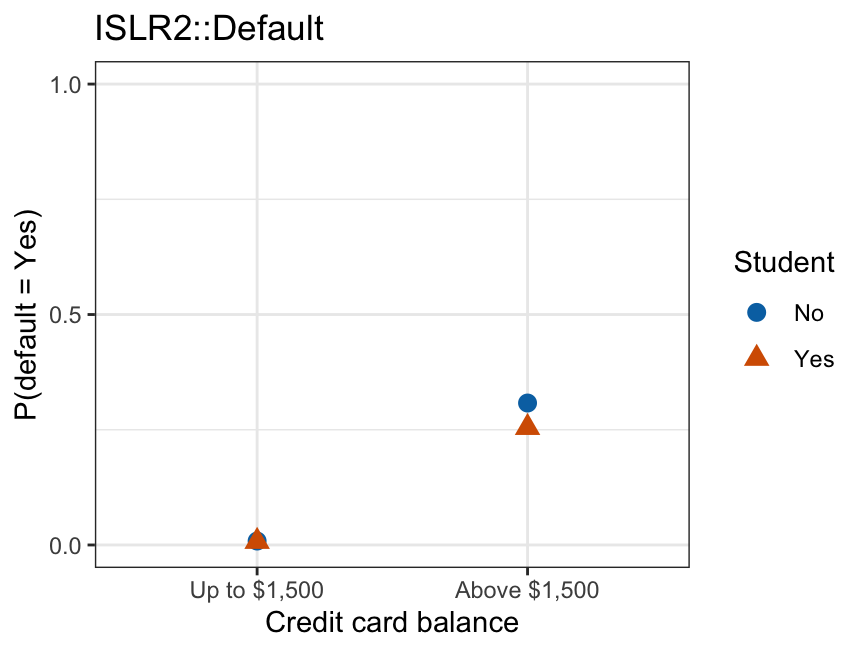
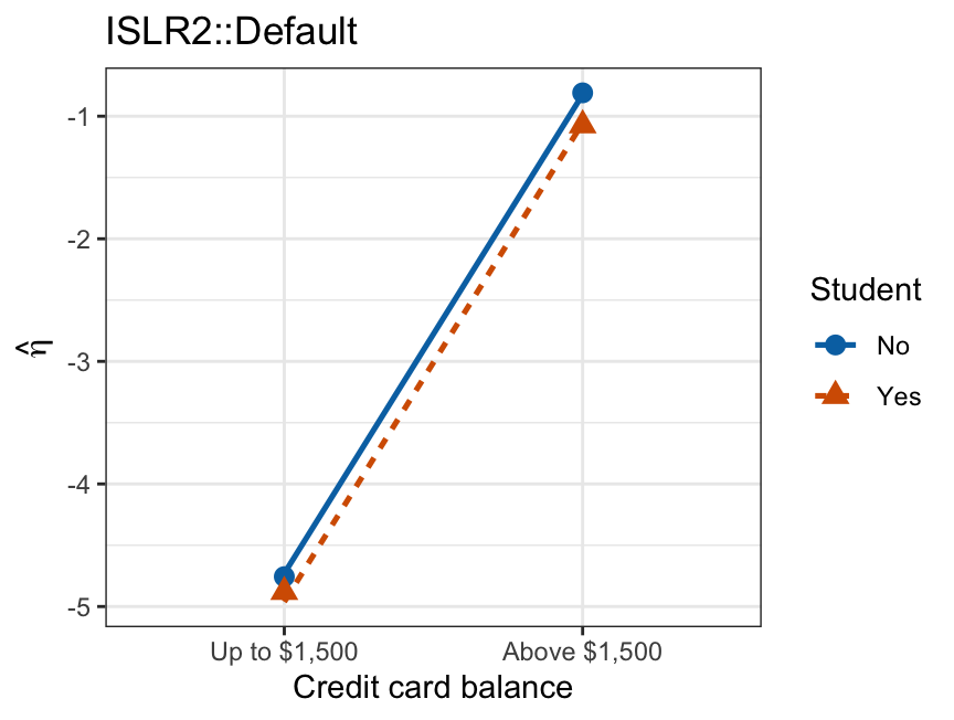
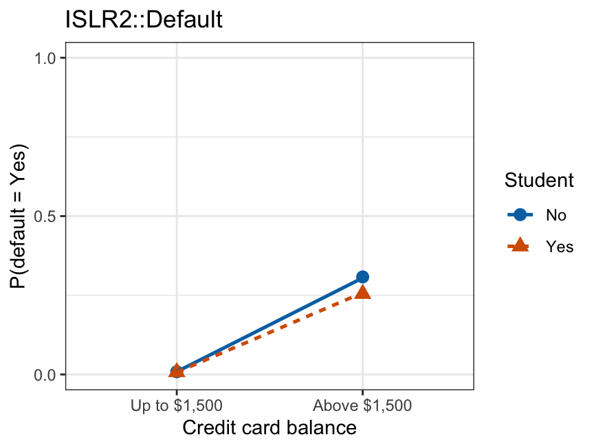
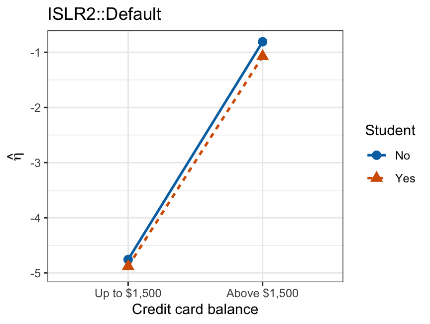
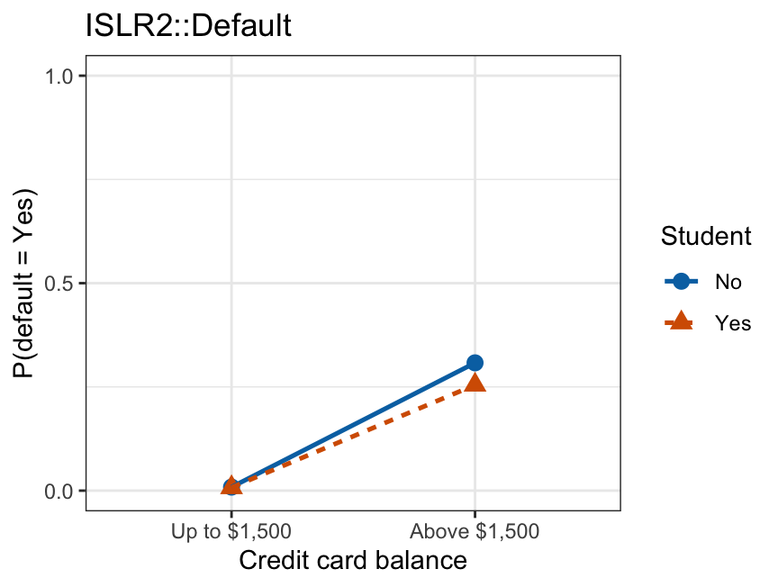
On the log-odds scale the lines climb \(3.8\)–\(3.9\) log-odds from the low-balance cells to the high-balance ones, so the student gap — the vertical distance between the two lines — is a small quantity inside that climb. The additive fit’s two lines are exactly parallel: one coefficient \(\hat\beta_2 = -0.232\) serves as the student gap at both balance levels, so neither line passes through both of its group’s observed points. The interaction fit’s lines pass through all four points — four coefficients for four cells — with the observed student gap \(-0.124\) log-odds below $1,500 and \(-0.264\) above it. On the probability scale the low-balance cells collapse together near \(0\), and only the high-balance cells separate visibly.
The same four cells read as fitted probabilities:
NoteCode
cat_cell_table <- function(model_name) {
  cat_fit |>
    filter(Model == model_name) |>
    mutate(p_hat = sprintf("%.4f", p_hat)) |>
    select(balance_cat, student, p_hat) |>
    pivot_wider(names_from = student, values_from = p_hat) |>
    mutate(balance_cat = c(Low = "Up to \\$1,500",
                           High = "Above \\$1,500")[as.character(balance_cat)]) |>
    knitr::kable(col.names = c("Balance", "Non-student", "Student"),
                 align = "lcc")
}

cat_add_table <- cat_cell_table("Additive")
cat_int_table <- cat_cell_table("Interaction")| Balance | Non-student | Student |
|---|---|---|
| Up to $1,500 | 0.0087 | 0.0070 |
| Above $1,500 | 0.3050 | 0.2582 |
| Balance | Non-student | Student |
|---|---|---|
| Up to $1,500 | 0.0085 | 0.0075 |
| Above $1,500 | 0.3080 | 0.2547 |
The interaction model’s four probabilities are the four observed cell proportions exactly, since it has one free coefficient per cell. The additive model’s four are not, since its three coefficients cannot reproduce four arbitrary numbers.
The coefficients behind those probabilities:
summary(balance_cat_glm)$coefficients Estimate Std. Error z value Pr(>|z|)
(Intercept) -4.7562038 0.1342000 -35.4411508 3.970358e-275
balance_catHigh 3.9467561 0.1662639 23.7379055 1.464979e-124
studentYes -0.1238032 0.2665216 -0.4645146 6.422791e-01
balance_catHigh:studentYes -0.1403602 0.3051092 -0.4600326 6.454928e-01The reference cell is a non-student with balance at or below $1,500, at log-odds \(\hat\beta_0 = -4.756\). Crossing $1,500 shifts that by \(\hat\beta_1 = 3.947\), being a student shifts it by \(\hat\beta_2 = -0.124\), and being both a high-balance customer and a student adds a further \(\hat\beta_3 = -0.140\) beyond the two separately, which the \(z\)-statistic \(-0.46\) cannot distinguish from zero. Both features are \(0/1\) indicators, so \(\hat\beta_3\) carries no units and comparing its size to \(\hat\beta_1\) or \(\hat\beta_2\) is fair.
The same hypothesis \(H_0: \beta_3 = 0\) can be tested by dropping the interaction column and comparing deviances, using the drop-in-deviance test of the previous lecture:
anova(cat_add, balance_cat_glm, test = "Chisq")Analysis of Deviance Table
Model 1: default ~ balance_cat + student
Model 2: default ~ balance_cat * student
Resid. Df Resid. Dev Df Deviance Pr(>Chi)
1 9997 1951.6
2 9996 1951.4 1 0.20881 0.6477Forcing one student effect on both balance levels costs \(G^2 = 0.209\) of deviance on \(1\) degree of freedom, \(p = 0.648\). These data give no evidence that the student effect differs between the two balance categories.
11.1.3 Continuous-categorical interactions
The combination easiest to visualize pairs one quantitative feature \(X\) with one indicator \(D\):
\[\eta = \beta_0 + \beta_1 X + \beta_2 D + \beta_3 XD.\]
Collecting the terms involving \(X\) shows what each coefficient does:
\[\log\left[\frac{p(X,D)}{1 - p(X,D)}\right] = \underbrace{(\beta_0 + \beta_2 D)}_{\text{log-odds intercept}} + \underbrace{(\beta_1 + \beta_3 D)}_{\text{log-odds slope on } X} X.\]
Setting \(X = 0\) and \(D = 0\) leaves \(\beta_0\), the log-odds of the event in the reference group at \(X = 0\), so \(e^{\beta_0}\) are the odds and \(\text{logistic}(\beta_0)\) the probability there. Adding \(\beta_2\) shifts that reference value to the indicated group, still at \(X = 0\).
The slope on \(X\) is a function of \(D\), which is the whole point of the interaction. Writing out the two levels:
- Reference level (\(D = 0\)): log-odds \(= \beta_0 + \beta_1 X\). A one-unit increase in \(X\) adds \(\beta_1\) to the log-odds and multiplies the odds by \(e^{\beta_1}\).
- Indicated level (\(D = 1\)): log-odds \(= (\beta_0 + \beta_2) + (\beta_1 + \beta_3) X\). A one-unit increase in \(X\) adds \(\beta_1 + \beta_3\) to the log-odds and multiplies the odds by \(e^{\beta_1 + \beta_3}\).
So there is no single odds ratio for \(X\). There are two, one per group, and their ratio is
\[\frac{e^{\beta_1 + \beta_3}}{e^{\beta_1}} = e^{\beta_3}.\]
\(e^{\beta_3}\) is a ratio of odds ratios: the factor by which one group’s per-unit odds ratio for \(X\) differs from the other’s. \(\beta_3 = 0\) makes that factor \(1\) and returns the additive model.
One caution carries over from the feature engineering lecture: \(\beta_1\) is the log-odds slope when \(D = 0\), not an average across the two groups. A second is that the \(X = 0\) at which \(\beta_0\) and \(\beta_2\) are defined may be a value \(X\) never takes. Hierarchy applies here as it did in linear regression: keep \(X\) and \(D\) in the model whenever \(XD\) is present.
glm(default ~ balance * student, data = Default, family = "binomial")The * expands to balance + student + balance:student, so the fitted model contains both main effects and the product, satisfying hierarchy automatically. Writing balance:student alone would drop the main effects, violating hierarchy: R responds by giving each group its own balance slope while forcing both to share a single intercept.
Written as functions of \(X\), the fitted log-odds for the two groups are
\[\hat\eta(X, 0) = \hat\beta_0 + \hat\beta_1 X, \qquad \hat\eta(X, 1) = \left(\hat\beta_0 + \hat\beta_2\right) + \left(\hat\beta_1 + \hat\beta_3\right) X.\]
Under the additive model \(\beta_3 = 0\), both lines have slope \(\hat\beta_1\): they are parallel, separated by exactly \(\hat\beta_2\) at every \(X\). Under the interaction model the slopes differ by \(\hat\beta_3\), so the lines are not parallel and, extended far enough, must cross. Parallel versus non-parallel on the linear-predictor scale is the visual signature that separates the two models. Each group’s decision boundary — the \(X\) where its own line crosses zero, since \(\hat p = 0.5\) there — sits wherever \(\hat\eta(X, d) = 0\) solves for that group’s \(d\); under the additive model a constant \(\hat\beta_2\) shifts both groups’ boundaries by the same amount, while under the interaction model the differing slopes can move them by different amounts entirely.
In R, predict() on a glm object returns both scales:
predict(fit, newdata = grid)                    # eta-hat, the linear predictor
predict(fit, newdata = grid, type = "response") # p-hat, the probability
Fitting both models on ISLR2::Default, with balance as \(X\) and the student indicator as \(D\), and plotting \(\hat\eta\) against balance draws those lines.
NoteCode
default_additive    <- glm(default ~ balance + student,
                           data = Default, family = "binomial")
default_interaction <- glm(default ~ balance * student,
                           data = Default, family = "binomial")

bda <- coef(default_additive)
bdi <- coef(default_interaction)

default_grid <- expand_grid(
  balance = seq(0, max(Default$balance), length.out = 300),
  student = factor(c("No", "Yes"), levels = levels(Default$student)))

default_link <- bind_rows(
  default_grid |> mutate(Model = "Additive",
                         eta = predict(default_additive, newdata = default_grid)),
  default_grid |> mutate(Model = "Interaction",
                         eta = predict(default_interaction, newdata = default_grid)))

# A shared base layer, so the two tabs below differ only in which model's
# lines are drawn on it -- the panel itself never changes size or shape.
default_link_base <- ggplot(mapping = aes(x = balance, y = eta,
                                          color = student, linetype = student)) +
  geom_hline(yintercept = 0, color = "grey60", linewidth = 0.3) +
  coord_cartesian(xlim = range(default_grid$balance),
                  ylim = range(default_link$eta)) +
  scale_color_manual(values = c("#0072B2", "#D55E00")) +
  labs(x = "Credit card balance ($)", y = expression(hat(eta)),
       color = "Student", linetype = "Student", title = "ISLR2::Default")

default_link_additive <- default_link_base +
  geom_line(data = filter(default_link, Model == "Additive"), linewidth = 0.9)

default_link_interaction <- default_link_base +
  geom_line(data = filter(default_link, Model == "Interaction"), linewidth = 0.9)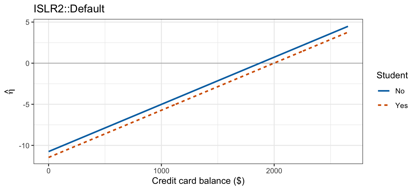
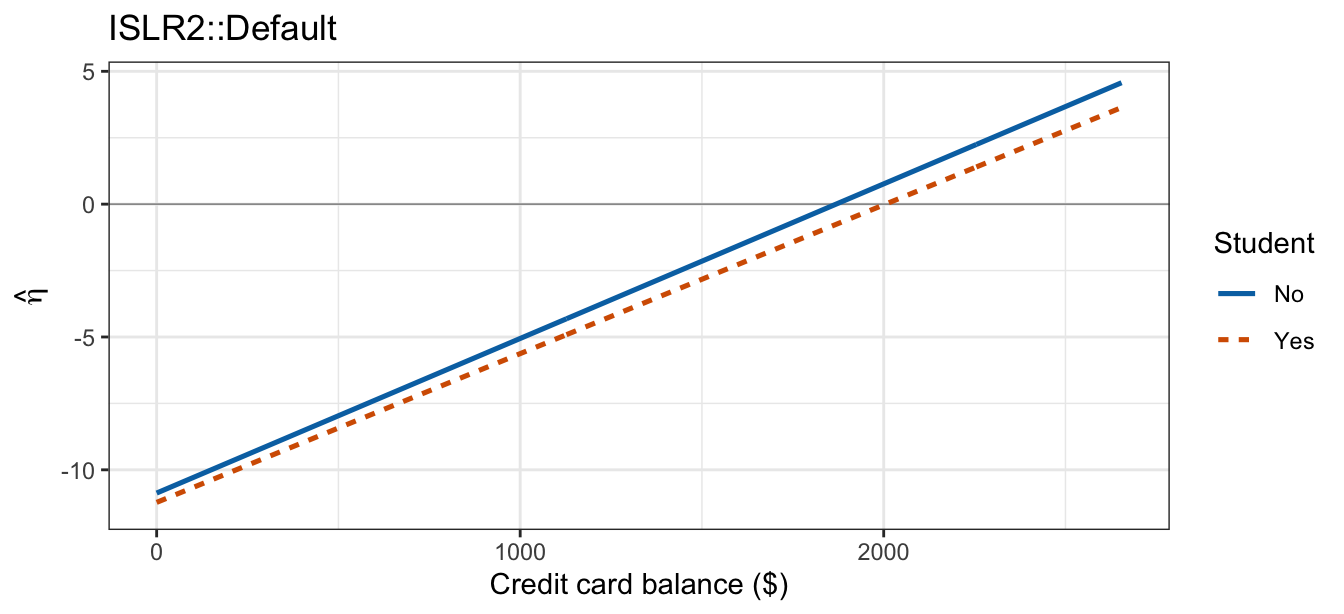
The additive tab’s two lines are exactly parallel, both with slope \(0.005738\) log-odds per dollar and separated by \(\hat\beta_2 = -0.715\) at every balance. The interaction tab’s two lines have slopes \(0.005819\) and \(0.005599\), a difference too small to see: switching between the tabs barely moves the picture.
The probability scale is what a decision actually uses, and it is a distorted view of the same two lines. Passing each line through \(\text{logistic}(\cdot)\) compresses it toward \(0\) and \(1\), so two parallel lines become two S-curves of identical shape that never cross, while two non-parallel lines become two S-curves of different steepness that can cross within the range of the data. Building the same comparison up from the raw data puts both fits on that scale.
NoteCode
default_prob <- bind_rows(
  default_grid |>
    mutate(Model = "Additive",
           p_hat = predict(default_additive, newdata = default_grid,
                           type = "response")),
  default_grid |>
    mutate(Model = "Interaction",
           p_hat = predict(default_interaction, newdata = default_grid,
                           type = "response")))

# The same shared-base idea, with the raw data as the layer every tab keeps.
# The legend is kept on every tab (with more visible swatches than the
# points themselves) rather than suppressed on this one layer, so the panel
# is the same width in all three tabs -- an unequal panel width across tabs
# looks, to a reader clicking between them, like the data changed.
default_prob_base <- ggplot(mapping = aes(x = balance, y = p_hat,
                                          color = student, linetype = student)) +
  geom_point(data = Default,
             aes(y = default_jit, shape = student),
             alpha = 0.08, size = 0.7) +
  guides(color = guide_legend(override.aes = list(alpha = 1, size = 2))) +
  coord_cartesian(xlim = range(default_grid$balance), ylim = c(-0.05, 1.05)) +
  scale_y_continuous(breaks = c(0, 0.5, 1)) +
  scale_color_manual(values = c("#0072B2", "#D55E00")) +
  labs(x = "Credit card balance ($)", y = "P(default = Yes)",
       color = "Student", linetype = "Student", shape = "Student",
       title = "ISLR2::Default")

default_prob_data <- default_prob_base

default_prob_additive <- default_prob_base +
  geom_line(data = filter(default_prob, Model == "Additive"), linewidth = 0.9)

default_prob_interaction <- default_prob_base +
  geom_line(data = filter(default_prob, Model == "Interaction"), linewidth = 0.9)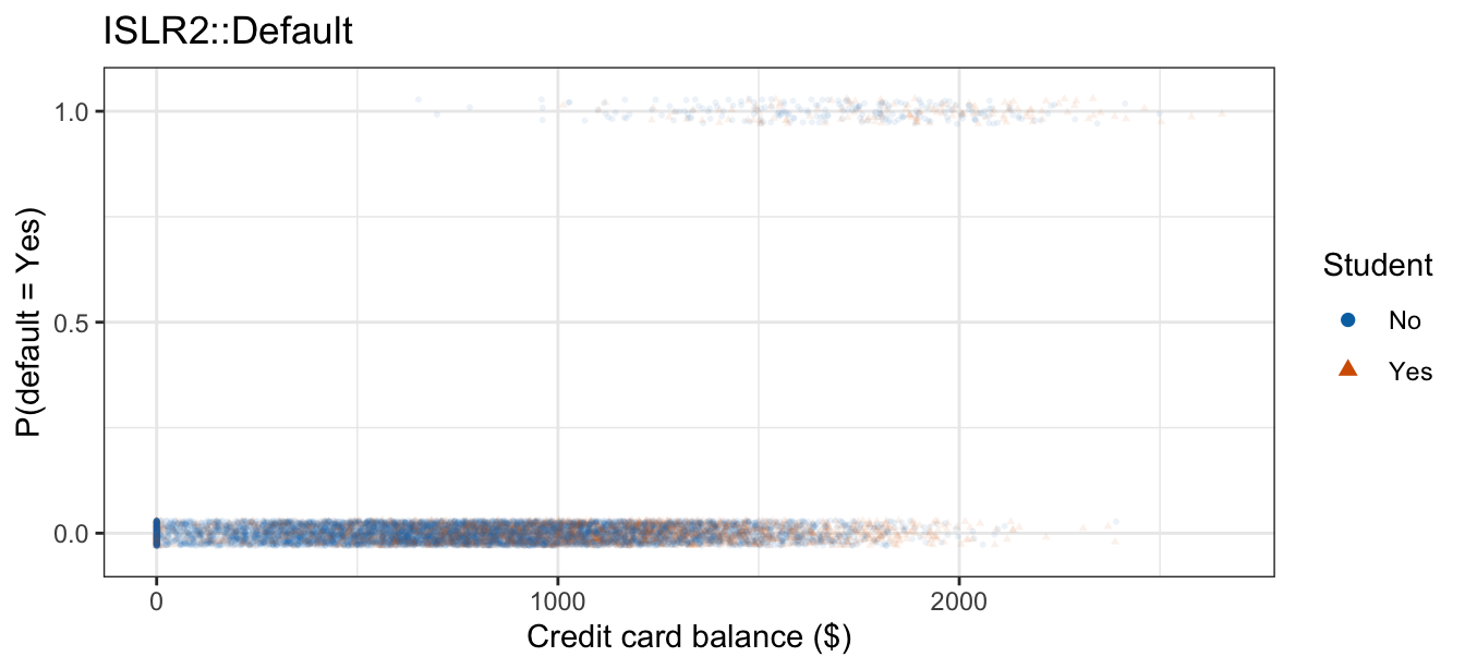
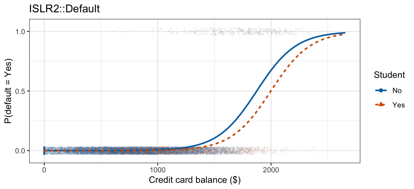
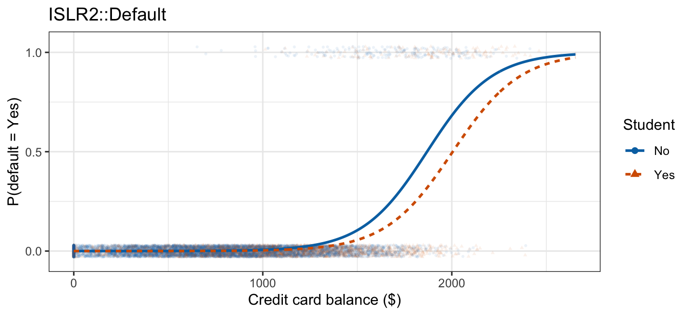
The data tab plots each customer’s outcome, jittered vertically, against balance, with students and non-students distinguished by color and shape. The two model tabs are nearly the same picture: two S-curves of all but identical shape, the student curve shifted right, whether or not the interaction is in the model.
The coefficients behind the interaction tab, with the \(z\)-test of \(H_0: \beta_3 = 0\) in its last row:
summary(default_interaction)$coefficients Estimate Std. Error z value Pr(>|z|)
(Intercept) -1.087468e+01 0.4639679171 -23.4384348 1.734470e-121
balance 5.818816e-03 0.0002936985 19.8122090 2.336069e-87
studentYes -3.512310e-01 0.8037332689 -0.4369994 6.621118e-01
balance:studentYes -2.196288e-04 0.0004780734 -0.4594039 6.459441e-01The intercept \(\hat\beta_0 = -10.87\) is the log-odds of default for a non-student carrying no balance at all, a value far outside anything the data contain. From that reference, \(\hat\beta_2\) moves a student with no balance by \(-0.351\) log-odds. The balance slope is \(\hat\beta_1 = 0.005819\) for non-students and \(\hat\beta_1 + \hat\beta_3 = 0.005599\) for students, so the two per-$100 odds ratios are \(1.789\) and \(1.751\).
The same hypothesis can be tested by dropping the interaction column and comparing deviances:
anova(default_additive, default_interaction, test = "Chisq")Analysis of Deviance Table
Model 1: default ~ balance + student
Model 2: default ~ balance * student
Resid. Df Resid. Dev Df Deviance Pr(>Chi)
1 9997 1571.7
2 9996 1571.5 1 0.20944 0.6472The \(z\)-statistic is \(-0.459\) with \(p = 0.646\); dropping the interaction raises the deviance by \(G^2 = 0.209\) on \(1\) degree of freedom, giving \(p = 0.647\). With one coefficient at stake the two are different statistics for the same hypothesis, each with an approximate \(\chi^2_1\) null distribution: the Wald statistic reads the curvature of the log-likelihood at \(\hat\beta\), while the deviance compares the log-likelihood itself at the two fits, which is why \(z^2 = 0.211\) and \(G^2\) come out close without being equal. Neither gives evidence that balance acts differently on students than on non-students.
Only the deviance test survives more than one coefficient. An indicator contributes exactly one interaction column, but a categorical feature with more than two levels contributes one per non-reference level, and no single \(z\)-test asks whether that feature interacts with \(X\) at all; the drop-in-deviance test asks the same question for \(k\) dropped columns as for one, \(G^2 = D_r - D_f\) approximately \(\chi^2_k\) where
- \(D_r\) is the deviance of the reduced model,
- \(D_f\) is the deviance of the full model, and
- \(k\) is the number of interaction columns dropped.
11.1.4 Continuous-continuous interactions
Two quantitative features multiply into a single new column, \(X_1 X_2\):
\[\eta = \beta_0 + \beta_1 X_1 + \beta_2 X_2 + \beta_3 X_1 X_2.\]
Collecting the terms involving \(X_1\) puts it in the same form the continuous-categorical case took:
\[\log\left[\frac{p(X_1,X_2)}{1 - p(X_1,X_2)}\right] = \underbrace{(\beta_0 + \beta_2 X_2)}_{\text{log-odds intercept}} + \underbrace{(\beta_1 + \beta_3 X_2)}_{\text{log-odds slope on } X_1} X_1.\]
Both the intercept and the slope on \(X_1\) are now functions of \(X_2\), and \(X_2\) is quantitative, so instead of one intercept and one slope per group there is a separate line for every value \(X_2\) can take. Fixing \(X_2\), a one-unit increase in \(X_1\) still changes the log-odds by \(\beta_1 + \beta_3 X_2\) and multiplies the odds by \(e^{\beta_1 + \beta_3 X_2}\).
Taking balance as \(X_1\) and income as \(X_2\) on ISLR2::Default, neither feature has levels to split the picture by, so the fit is drawn by splitting one of them: customers are grouped into income quartiles, and each group’s fitted curve is drawn at that group’s median income against the full range of balance. Both models are fit on income as recorded; the quartiles only decide which four curves to draw.
NoteCode
Default <- Default |>
  mutate(income_q = cut(income, breaks = quantile(income, 0:4 / 4),
                        include.lowest = TRUE,
                        labels = c("Q1 (lowest)", "Q2", "Q3", "Q4 (highest)")))

balance_income_add <- glm(default ~ balance + income, data = Default,
                          family = "binomial")
balance_income_glm <- glm(default ~ balance * income, data = Default,
                          family = "binomial")

# One curve per income quartile, each evaluated at that quartile's median
# income -- the fit is a function of income itself, so a group needs a single
# income value to be drawn at.
income_median <- Default |>
  group_by(income_q) |>
  summarize(income = median(income), .groups = "drop")

income_grid <- expand_grid(
  balance  = seq(0, max(Default$balance), length.out = 300),
  income_q = income_median$income_q) |>
  left_join(income_median, by = "income_q")

income_link <- bind_rows(
  income_grid |> mutate(Model = "Additive",
                        eta = predict(balance_income_add, newdata = income_grid)),
  income_grid |> mutate(Model = "Interaction",
                        eta = predict(balance_income_glm, newdata = income_grid)))

# Four groups, so shape and linetype cannot simply duplicate a two-level color
# scale; viridis keeps the four distinguishable without color. No Data tab on
# this scale, the same way the continuous-categorical case has none -- raw
# 0/1 outcomes have no finite log-odds to plot.
income_link_base <- ggplot(mapping = aes(x = balance, y = eta,
                                         color = income_q, linetype = income_q)) +
  geom_hline(yintercept = 0, color = "grey60", linewidth = 0.3) +
  coord_cartesian(xlim = range(income_grid$balance),
                  ylim = range(income_link$eta)) +
  scale_color_viridis_d(end = 0.8) +
  labs(x = "Credit card balance ($)", y = expression(hat(eta)),
       color = "Income\nquartile", linetype = "Income\nquartile",
       title = "ISLR2::Default")

income_link_additive <- income_link_base +
  geom_line(data = filter(income_link, Model == "Additive"), linewidth = 0.9)

income_link_interaction <- income_link_base +
  geom_line(data = filter(income_link, Model == "Interaction"), linewidth = 0.9)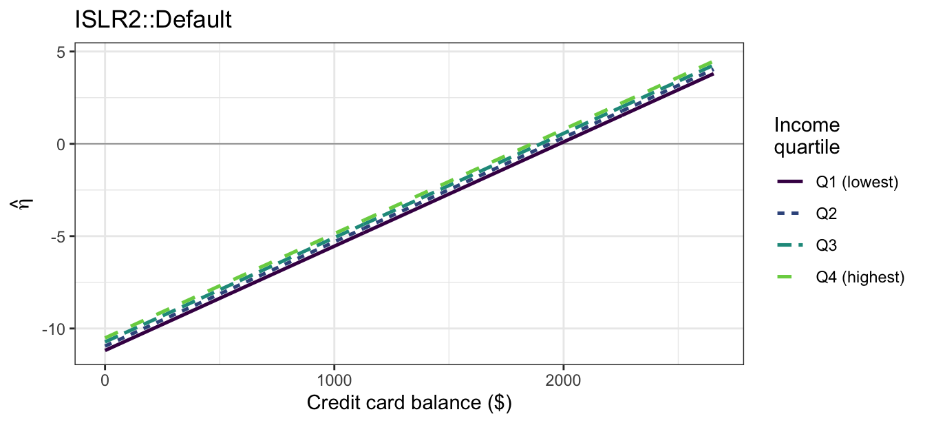
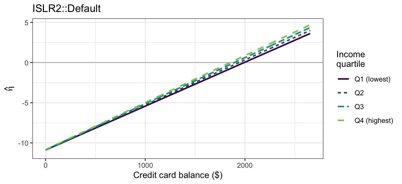
Under the additive model the four lines are exactly parallel, each shifted from the next by a fixed amount of log-odds. Under the interaction model the slope on balance itself grows with income, so the four lines fan out instead of staying parallel — the same parallel-versus-not signature the continuous-categorical case showed, now with four lines instead of two.
The probability scale is what a decision actually uses, and it is a distorted view of the same four lines: passing each one through \(\text{logistic}(\cdot)\) compresses it toward \(0\) and \(1\).
NoteCode
income_prob <- bind_rows(
  income_grid |> mutate(Model = "Additive",
                        p_hat = predict(balance_income_add,
                                        newdata = income_grid,
                                        type = "response")),
  income_grid |> mutate(Model = "Interaction",
                        p_hat = predict(balance_income_glm,
                                        newdata = income_grid,
                                        type = "response")))

# Observed default rates in $400-wide balance bins within each income
# quartile, dropped where a bin holds fewer than 50 customers.
income_binned <- Default |>
  mutate(bin = cut(balance, breaks = seq(0, 2800, by = 400),
                   include.lowest = TRUE)) |>
  group_by(income_q, bin) |>
  summarize(balance = mean(balance), rate = mean(default01), n = n(),
            .groups = "drop") |>
  filter(n >= 50)

# Four groups, so shape and linetype cannot simply duplicate a two-level
# color scale; viridis keeps the four distinguishable without color.
income_base <- ggplot(mapping = aes(x = balance, y = p_hat,
                                    color = income_q, linetype = income_q)) +
  geom_point(data = income_binned,
             aes(y = rate, size = n, shape = income_q)) +
  coord_cartesian(xlim = range(income_grid$balance), ylim = c(0, 1)) +
  scale_y_continuous(breaks = c(0, 0.5, 1)) +
  scale_color_viridis_d(end = 0.8) +
  scale_shape_manual(values = c(16, 17, 15, 18)) +
  scale_size_area(max_size = 4) +
  labs(x = "Credit card balance ($)", y = "P(default = Yes)",
       color = "Income\nquartile", linetype = "Income\nquartile",
       shape = "Income\nquartile", size = "Customers\nin bin",
       title = "ISLR2::Default")

income_data <- income_base

income_additive <- income_base +
  geom_line(data = filter(income_prob, Model == "Additive"), linewidth = 0.9)

income_interaction <- income_base +
  geom_line(data = filter(income_prob, Model == "Interaction"), linewidth = 0.9)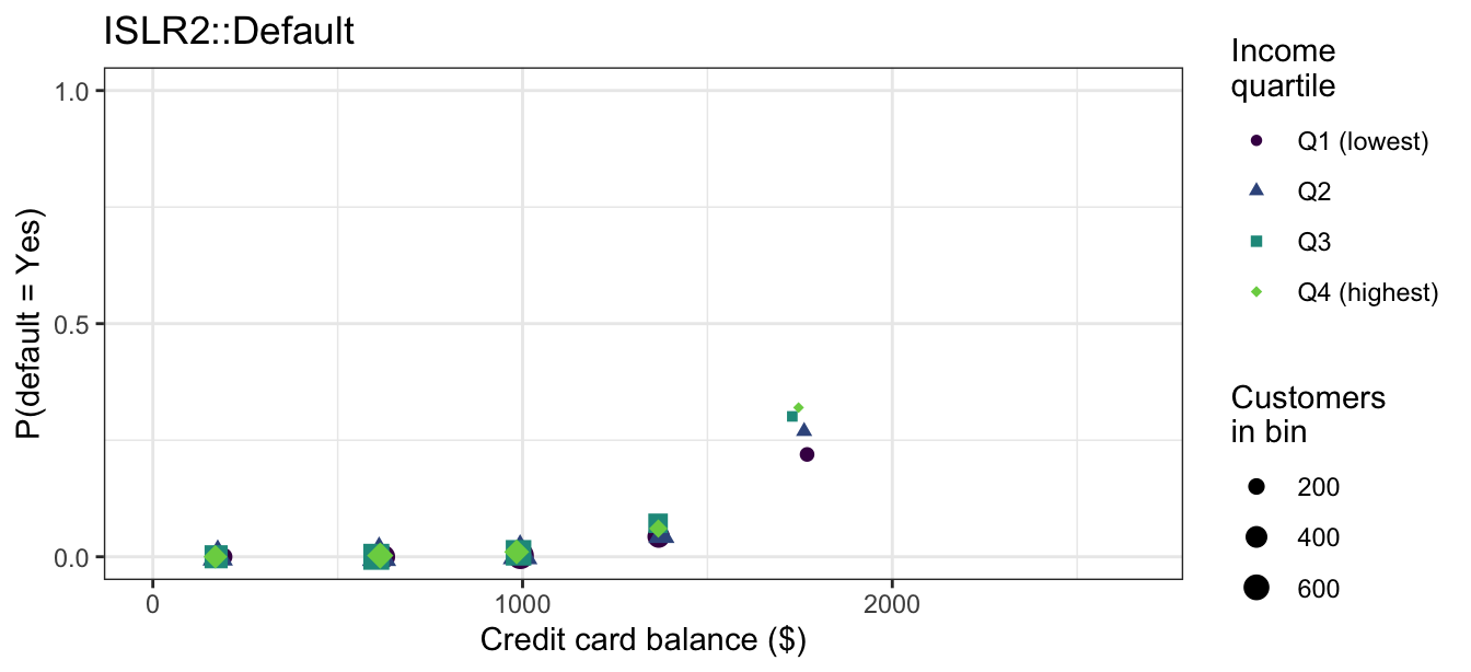
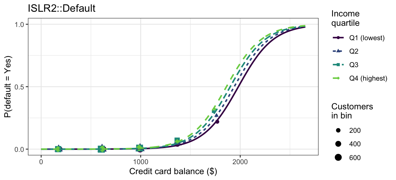
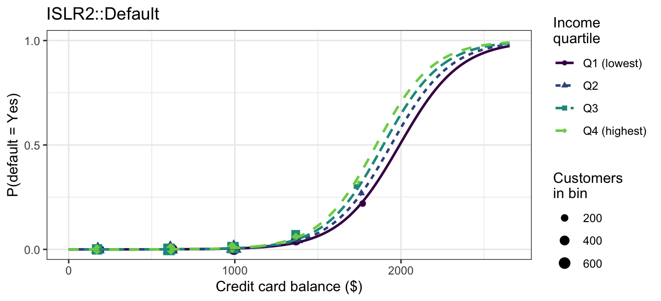
The additive tab draws four curves of identical shape, each shifted from the next by a fixed amount of log-odds, so no pair of them ever crosses. The interaction tab lets the balance slope grow with income, and its four curves pull apart at high balances and close up at low ones: at a balance of $2,000 the fitted probabilities span 0.16 under the additive model and 0.19 under the interaction. Switching between the tabs changes the picture very little.
The coefficients behind the interaction tab:
summary(balance_income_glm)$coefficients Estimate Std. Error z value Pr(>|z|)
(Intercept) -1.091573e+01 9.488860e-01 -11.50372889 1.263369e-30
balance 5.265278e-03 5.647706e-04 9.32286069 1.132450e-20
income 1.599661e-06 2.682921e-05 0.05962384 9.524552e-01
balance:income 1.193329e-08 1.638066e-08 0.72849895 4.663082e-01The intercept \(\hat\beta_0 = -10.92\) is the log-odds of default for a customer with no balance and no income, an extrapolation well outside the data. The estimated interaction, \(\hat\beta_3 \approx 1.19\times 10^{-8}\), looks negligible beside \(\hat\beta_1 \approx 0.00527\), but that comparison is not evidence of anything: income is recorded in dollars running into the tens of thousands, and re-expressing it in thousands of dollars would multiply \(\hat\beta_3\) by \(1{,}000\) while leaving every fitted probability, and the \(z\)-statistic \(0.728\), exactly where they are. Whether the dependence matters is a question for a test.
anova(balance_income_add, balance_income_glm, test = "Chisq")Analysis of Deviance Table
Model 1: default ~ balance + income
Model 2: default ~ balance * income
Resid. Df Resid. Dev Df Deviance Pr(>Chi)
1 9997 1579.0
2 9996 1578.4 1 0.53539 0.4644Dropping the product column costs \(G^2 = 0.535\) of deviance on \(1\) degree of freedom, \(p = 0.464\), agreeing with the \(z\)-test and with the figures: these data give no evidence that balance’s effect on the log-odds of default varies with income.
11.2 Polynomials
A polynomial is a basis function like any other: the column \(X^2\) joins \(X\) in the linear predictor and lets a single feature’s effect curve instead of running straight. Interacted with an indicator, it gives each group its own quadratic rather than its own straight line. With balance as \(X\) and the student indicator as \(D\), the two models are
\[\text{additive:} \qquad \eta = \beta_0 + \beta_1 X + \beta_2 X^2 + \beta_3 D,\]
\[\text{interaction:} \qquad \eta = \beta_0 + \beta_1 X + \beta_2 X^2 + \beta_3 D + \beta_4 XD + \beta_5 X^2 D,\]
where
- \(X\) is the credit card balance and \(X^2\) its square,
- \(D = \mathrm{I}(\texttt{student} = \texttt{Yes})\),
- \(\beta_1\) and \(\beta_2\) are the reference group’s linear and quadratic coefficients, and
- \(\beta_4\) and \(\beta_5\) are how the indicated group’s linear and quadratic coefficients differ from the reference group’s.
Setting \(D\) to each of its two values splits the interaction model into a pair of quadratics:
\[\text{reference group } (D = 0): \qquad \eta = \beta_0 + \beta_1 X + \beta_2 X^2,\]
\[\text{indicated group } (D = 1): \qquad \eta = (\beta_0 + \beta_3) + (\beta_1 + \beta_4) X + (\beta_2 + \beta_5) X^2.\]
The two quadratics share no coefficient: six parameters buy each group a curve of its own shape. The additive model spends four instead and gives both groups the identical shape \(\beta_1 X + \beta_2 X^2\), separated by the constant \(\beta_3\) at every balance — the polynomial analogue of the two parallel lines the continuous-categorical case produced.
In R the pair of columns is poly(balance, 2), and it enters an interaction the same way a single linear term did, poly(balance, 2) * student. poly() returns an orthogonal basis for the same span rather than the raw \(X\) and \(X^2\), which changes what the individual coefficients mean but leaves the fitted values, and the test below, unchanged.
Four fits are drawn against the same raw data below: the additive and interaction models of the continuous-categorical subsection, whose group curves are straight lines on the log-odds scale, and the two quadratic models above.
NoteCode
poly_additive    <- glm(default ~ poly(balance, 2) + student,
                        data = Default, family = "binomial")
poly_interaction <- glm(default ~ poly(balance, 2) * student,
                        data = Default, family = "binomial")

poly_grid <- expand_grid(
  balance = seq(0, max(Default$balance), length.out = 300),
  student = factor(c("No", "Yes"), levels = levels(Default$student)))

# The linear fits are the ones already estimated in the Interactions section,
# so the linear tabs below redraw those models rather than re-fitting them.
poly_models <- list("Additive (linear)"       = default_additive,
                    "Interaction (linear)"    = default_interaction,
                    "Additive (quadratic)"    = poly_additive,
                    "Interaction (quadratic)" = poly_interaction)

poly_pred <- bind_rows(lapply(names(poly_models), function(nm) {
  fit <- poly_models[[nm]]
  poly_grid |> mutate(Model = nm,
                      eta   = predict(fit, newdata = poly_grid),
                      p_hat = predict(fit, newdata = poly_grid,
                                      type = "response"))
}))

# The same shared-base idea used throughout this lecture: one base layer per
# scale, with each tab adding only its own pair of curves. Both bases use a
# single window covering all four fits, so switching tabs moves the curves
# and nothing else.
poly_link_base <- ggplot(mapping = aes(x = balance, y = eta,
                                       color = student, linetype = student)) +
  geom_hline(yintercept = 0, color = "grey60", linewidth = 0.3) +
  coord_cartesian(xlim = range(poly_grid$balance),
                  ylim = range(poly_pred$eta)) +
  scale_color_manual(values = c("#0072B2", "#D55E00")) +
  labs(x = "Credit card balance ($)", y = expression(hat(eta)),
       color = "Student", linetype = "Student", title = "ISLR2::Default")

poly_prob_base <- ggplot(mapping = aes(x = balance, y = p_hat,
                                       color = student, linetype = student)) +
  geom_point(data = Default, aes(y = default_jit, shape = student),
             alpha = 0.08, size = 0.7) +
  guides(color = guide_legend(override.aes = list(alpha = 1, size = 2))) +
  coord_cartesian(xlim = range(poly_grid$balance), ylim = c(-0.05, 1.05)) +
  scale_y_continuous(breaks = c(0, 0.5, 1)) +
  scale_color_manual(values = c("#0072B2", "#D55E00")) +
  labs(x = "Credit card balance ($)", y = "P(default = Yes)",
       color = "Student", linetype = "Student", shape = "Student",
       title = "ISLR2::Default")

poly_curves <- function(base, nm) {
  base + geom_line(data = filter(poly_pred, Model == nm), linewidth = 0.9)
}

poly_link_lin_add  <- poly_curves(poly_link_base, "Additive (linear)")
poly_link_lin_int  <- poly_curves(poly_link_base, "Interaction (linear)")
poly_link_quad_add <- poly_curves(poly_link_base, "Additive (quadratic)")
poly_link_quad_int <- poly_curves(poly_link_base, "Interaction (quadratic)")

poly_prob_data     <- poly_prob_base
poly_prob_lin_add  <- poly_curves(poly_prob_base, "Additive (linear)")
poly_prob_lin_int  <- poly_curves(poly_prob_base, "Interaction (linear)")
poly_prob_quad_add <- poly_curves(poly_prob_base, "Additive (quadratic)")
poly_prob_quad_int <- poly_curves(poly_prob_base, "Interaction (quadratic)")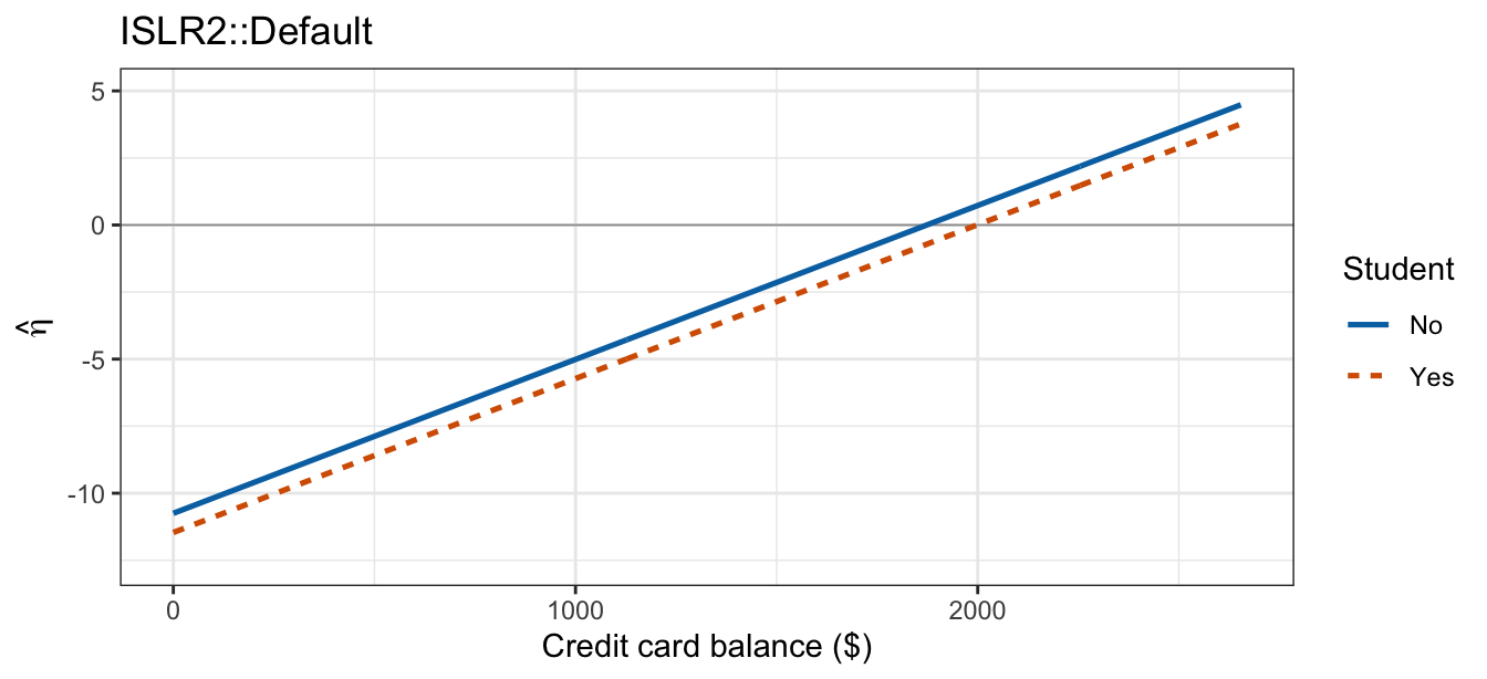
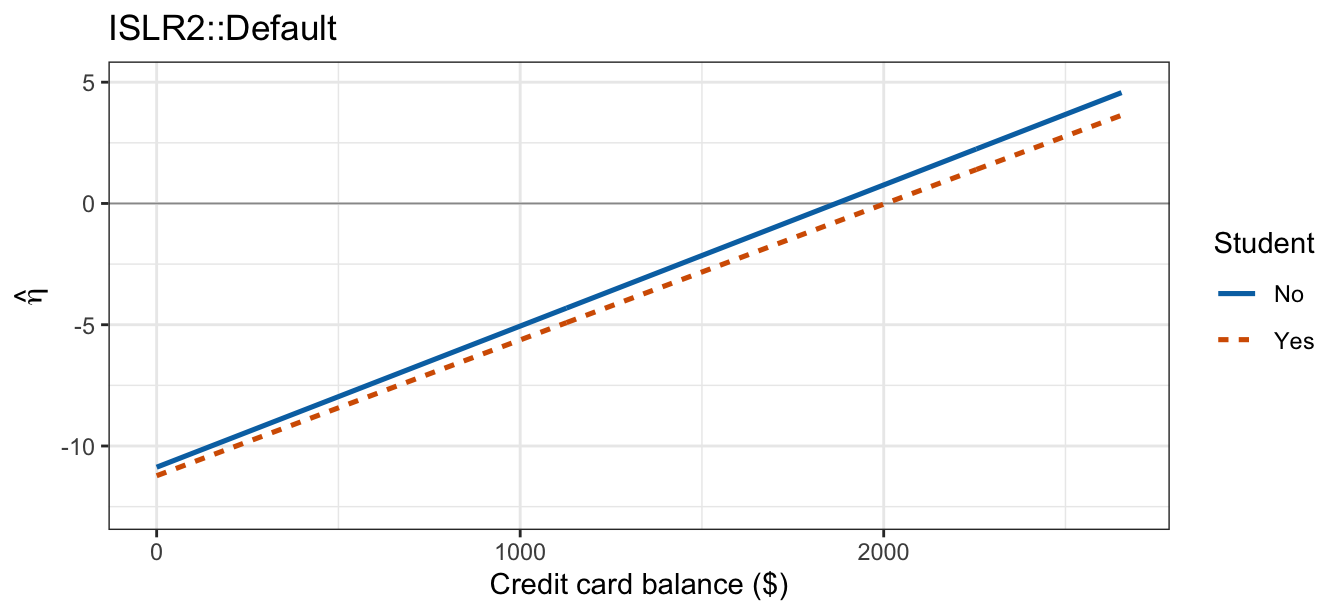
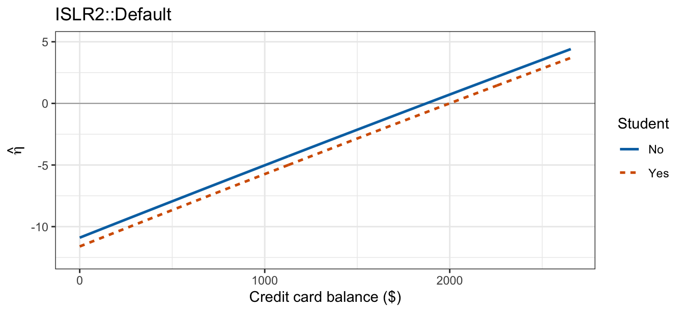
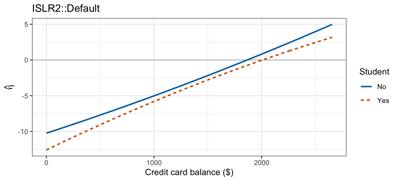
The two linear tabs are the parallel and near-parallel lines of the continuous-categorical subsection. The quadratic tabs add curvature, but too little of it to see: over the observed range of balance both still look like straight lines. What does differ between them is the separation between the two groups — constant in the additive tab, where one shared shape is shifted by \(\hat\beta_3\), and widening toward both ends of the balance range in the interaction tab, where the student curve takes its own linear and quadratic coefficients.
The same four fits on the probability scale, against the raw outcomes:
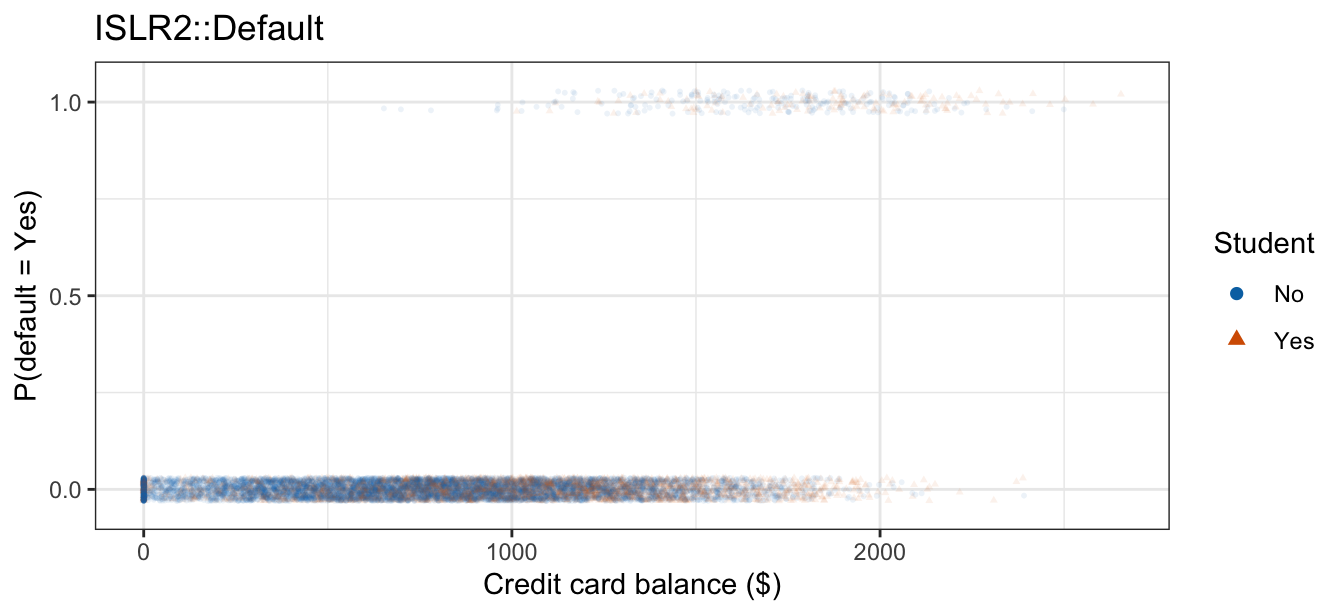
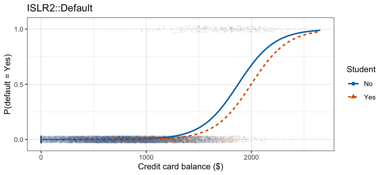
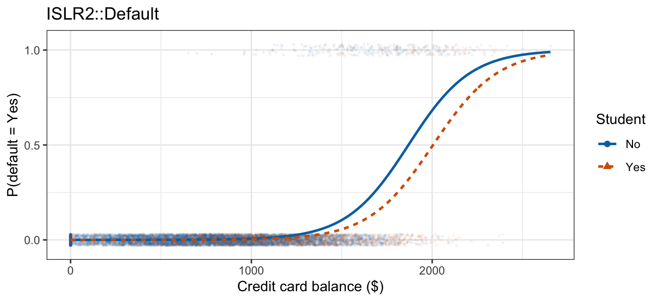
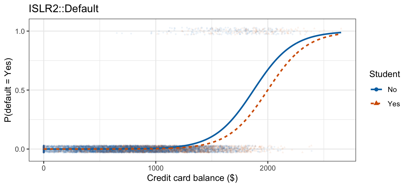
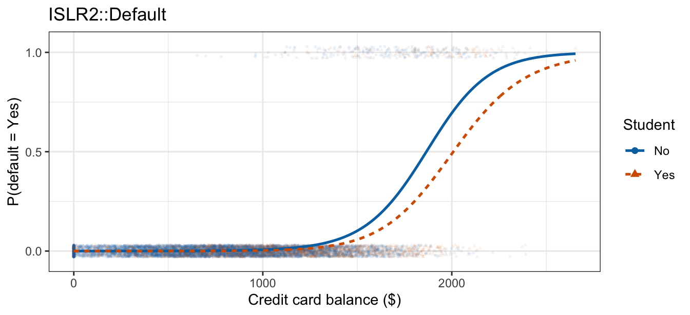
Logistic compression makes all four tabs nearly the same picture: two S-curves of all but identical shape with the student curve shifted right. What separated the quadratic tabs on the log-odds scale happens at balances where the fitted probability is already pinned near \(0\) or \(1\), so it leaves no visible trace here.
Whether the quadratic model needs the interaction is a comparison of the two quadratic fits, and the interaction contributes two coefficients — one per polynomial column — so it takes a drop-in-deviance test rather than a \(z\):
anova(poly_additive, poly_interaction, test = "Chisq")Analysis of Deviance Table
Model 1: default ~ poly(balance, 2) + student
Model 2: default ~ poly(balance, 2) * student
Resid. Df Resid. Dev Df Deviance Pr(>Chi)
1 9996 1571.7
2 9994 1570.9 2 0.77336 0.6793Forcing both groups onto one quadratic shape costs \(G^2 = 0.773\) of deviance on \(2\) degrees of freedom, \(p = 0.679\). Adding curvature does not manufacture an interaction where the data do not support one: the verdict is the same as it was for the straight-line fits.
11.3 Step functions
A step function is likewise just a set of indicator columns, \(C_j(X) = \mathrm{I}(c_j \le X < c_{j+1})\) for \(j = 1, \ldots, p\), built from cut points \(-\infty = c_0 < c_1 < \cdots < c_p < c_{p+1} = \infty\) exactly as in the flexibility lecture, with \([c_0, c_1)\) the reference bin and cut(x, breaks) in place of poly(x, degree). Coefficients are read the same way: \(\beta_j\) is the log-odds difference between bin \(j\) and the reference bin, so \(e^{\beta_j}\) is the odds ratio between those two bins — where in linear regression \(\beta_j\) was a difference between bin means.
More bins mean a more flexible fit, at the same bias-variance cost flexibility always carries: with enough bins the step function tracks the training data closely, at the price of a noisier estimate in any bin with few observations.
Paired with an indicator \(D\), the bins offer the same choice between an additive model and an interaction the previous two sections did:
\[\text{additive:} \qquad \eta = \beta_0 + \sum_{j=1}^{p} \beta_j C_j(X) + \gamma D,\]
\[\text{interaction:} \qquad \eta = \beta_0 + \sum_{j=1}^{p} \beta_j C_j(X) + \gamma D + \sum_{j=1}^{p} \delta_j C_j(X) D,\]
where
- \(C_j(X)\) is the indicator for bin \(j\), with bin \(0\) the reference,
- \(\gamma\) is the log-odds difference between the two groups in the reference bin, and
- \(\delta_j\) is how that difference in bin \(j\) departs from \(\gamma\).
The additive model spends \(p + 2\) parameters and makes every bin’s group difference the same \(\gamma\), so the two groups’ staircases have identical step heights and are separated by \(\gamma\) everywhere. The interaction model spends \(2(p + 1)\) and gives the two groups a free log-odds value in every bin, one parameter per bin-by-group cell — a categorical-categorical interaction with \(p + 1\) bins in place of two categories.
NoteCode
step_grid <- expand_grid(
  balance = seq(0, max(Default$balance), length.out = 400),
  student = factor(c("No", "Yes"), levels = levels(Default$student)))

# The same $400-wide-bin, by-student grouping used to check the additive fit
# in the previous lecture, so the observed data look the same way here as
# they did there. default01 was added to Default in the Interactions section
# above.
balance_bin_width <- 400
balance_binned <- Default |>
  mutate(bin = cut(balance, breaks = seq(0, 2800, by = balance_bin_width),
                   include.lowest = TRUE)) |>
  group_by(student, bin) |>
  summarize(balance = mean(balance), rate = mean(default01), n = n(),
            .groups = "drop") |>
  filter(n >= 100)

step_base <- ggplot(mapping = aes(x = balance)) +
  geom_point(data = balance_binned,
             aes(y = rate, color = student, shape = student, size = n)) +
  coord_cartesian(xlim = range(step_grid$balance), ylim = c(0, 1)) +
  scale_y_continuous(breaks = c(0, 0.5, 1)) +
  scale_color_manual(values = c("#0072B2", "#D55E00")) +
  scale_size_area(max_size = 5) +
  labs(x = "Credit card balance ($)", y = "P(default = Yes)",
       color = "Student", shape = "Student", size = "Customers\nin bin",
       title = "ISLR2::Default")

step_curve <- function(breaks) {
  fit <- glm(default ~ cut(balance, breaks = breaks, include.lowest = TRUE) *
               student,
             data = Default, family = "binomial")
  step_grid |> mutate(p_hat = predict(fit, newdata = step_grid,
                                      type = "response"))
}

step_line <- function(breaks) {
  list(geom_line(data = step_curve(breaks),
                 aes(y = p_hat, color = student, linetype = student),
                 linewidth = 0.9),
       labs(linetype = "Student"))
}

# Explicit, unequal-width breaks rather than cut(balance, breaks = k): every
# bin now has to hold both outcomes within *each* student group, not just
# overall, and equal-width bins leave the lowest bin with no student defaults
# at all once k reaches 4 (an empty cell is a preview of the separation the
# next lecture covers). Predicting from a re-fit cut() on new data is also
# fragile unless the same breaks are passed to both the fit and the grid.
step_data <- step_base
step_2bin <- step_base + step_line(c(0, 1350, 2700))
step_4bin <- step_base + step_line(c(0, 1100, 1500, 1900, 2700))
step_8bin <- step_base +
  step_line(c(0, 1100, 1300, 1500, 1700, 1900, 2100, 2300, 2700))
Each fit below is the interaction model, cut(balance, breaks) * student, giving the two groups separate staircases over the same bins as the bin count doubles from two to eight; the observed points are the default rate in the same $400-wide bins the previous lecture used, split by student.
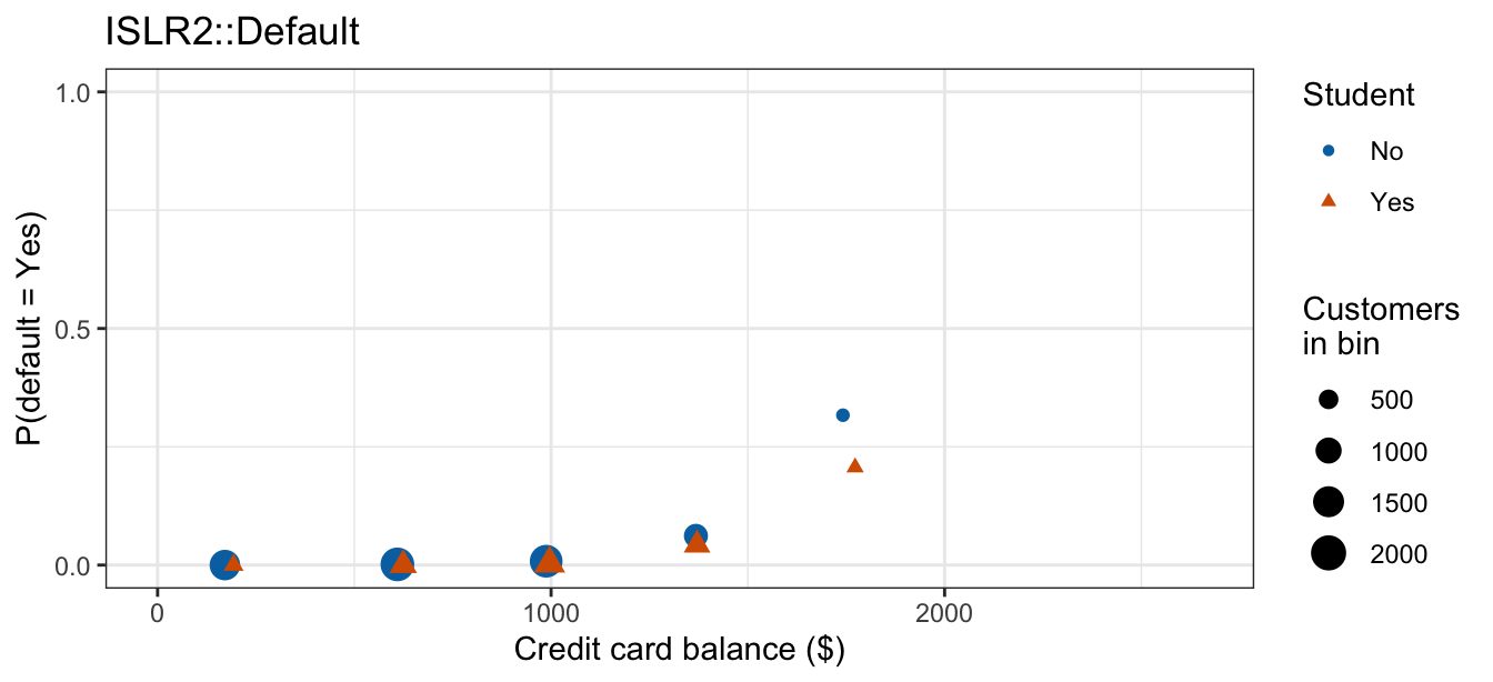
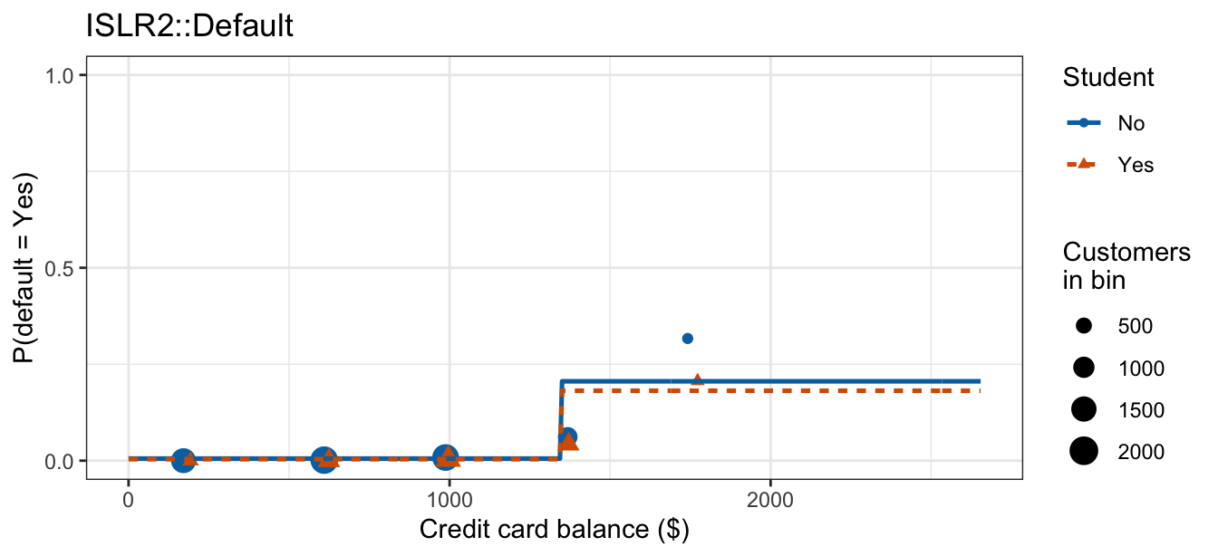
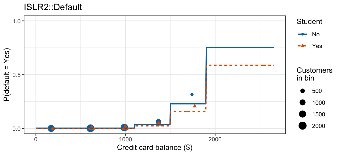
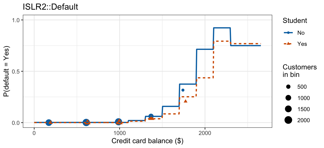
Two bins give each group one flat stretch and one jump, barely distinguishing low balances from high; each doubling adds detail the staircases can track, until eight bins trace nearly the same rise the smooth logistic curve of the earlier lectures did. Interacting the bins with student gives each group its own height in every bin, so the two staircases run together at low balances, where almost nobody defaults, and separate above roughly $1,500, the student staircase sitting below the non-student one over most of that range.
The price of that detail is visible in the eight-bin tab, where the staircases stop rising monotonically, cross each other, and jump around: only 4 non-students and 13 students carry a balance above $2,300, so the top bin’s two estimates are each built on a handful of customers. Every added bin is another pair of coefficients to estimate, and the data have to be spread across all of them.
11.4 Examples
Two examples follow, asking different kinds of question of the same machinery. The first is an inference question: is one feature’s effect the same in two groups? Its answer is a statement about a parameter, and a test delivers it. The second is a prediction question: what probability should a decision use at a feature combination the model is about to be asked about? Its answer is a number the fitted model produces, and the choice between additive and interaction changes that number.
11.4.1 Student-specific balance effects
Question. The previous lecture fit default ~ balance + student additively, which forces the per-dollar balance odds ratio to be identical for students and non-students. Is that assumption right? The quantity of interest is the parameter \(\beta_3\) in \(\eta = \beta_0 + \beta_1 X + \beta_2 D + \beta_3 XD\), and the analysis is finished when there is a verdict on whether it is zero — no customer’s predicted probability is being asked for.
Data. The same 10,000 simulated credit card customers as in the previous two lectures, with balance as the quantitative feature \(X\), the student indicator \(D = \mathrm{I}(\texttt{student} = \texttt{Yes})\), and \(Y_i = 1\) when customer \(i\) defaults. The raw outcomes, and both fitted models on both scales, are the figures of the continuous-categorical subsection above.
The interaction fit gives each group its own balance slope, and so its own per-$100 odds ratio:
NoteCode
dcoef <- summary(default_interaction)$coefficients
z_d   <- dcoef["balance:studentYes", "z value"]
p_d   <- dcoef["balance:studentYes", "Pr(>|z|)"]
ci_d  <- confint.default(default_interaction)["balance:studentYes", ]

or_d <- tibble(
  student = c("No (reference)", "Yes"),
  slope   = c(bdi[2], bdi[2] + bdi[4]),
  or100   = exp(100 * c(bdi[2], bdi[2] + bdi[4]))
)

or_d_table <- or_d |>
  mutate(slope = sprintf("%.6f", slope),
         or100 = sprintf("%.3f", or100)) |>
  knitr::kable(col.names = c("Student", "Slope (log-odds per \\$1)",
                             "Odds ratio per \\$100"),
align = "lcc")| Student | Slope (log-odds per $1) | Odds ratio per $100 |
|---|---|---|
| No (reference) | 0.005819 | 1.789 |
| Yes | 0.005599 | 1.751 |
The two per-$100 odds ratios differ by 0.04, the difference the interaction was added to capture, and it is \(\hat\beta_3\) that carries it. That estimate has \(z = -0.46\) with a \(p\)-value of \(0.646\), and a 95% Wald interval running from \(-0.00116\) to \(0.00072\), comfortably containing \(0\); the drop-in-deviance test of the same hypothesis reached the same verdict, \(G^2 = 0.209\) on \(1\) degree of freedom with \(p = 0.647\).
NoteBeyond this course
The Akaike information criterion, \(\text{AIC} = -2\ell(\hat\beta) + 2k\) for a model with \(k\) estimated parameters, scores a fit by its log-likelihood with a penalty for the number of parameters it used; lower is better. It gives a second, test-free reading of whether a term earns its place.
aic_d_table <- tibble(
  Model = c("`default ~ balance + student`", "`default ~ balance * student`"),
  k     = c(length(bda), length(bdi)),
  AIC   = sprintf("%.2f", c(AIC(default_additive), AIC(default_interaction)))
) |>
knitr::kable(col.names = c("Model", "Parameters", "AIC"), align = "lcc")| Model | Parameters | AIC |
|---|---|---|
default ~ balance + student |
3 | 1577.68 |
default ~ balance * student |
4 | 1579.47 |
Adding the interaction makes AIC worse here: the extra parameter buys less log-likelihood than it costs.
Conclusion. Balance’s effect on the odds of default does not depend on student status in these data. The interval for \(\beta_3\) contains zero, both tests decline to reject, and the two fitted models are visually indistinguishable on both scales, so the additive model of the previous lecture is the one to report. Not every plausible interaction is a real one; fitting it was still the right move, because the additive assumption was checked rather than assumed.
11.4.2 Store-specific price effects
Question. Citrus Hill and Minute Maid are competing orange juice brands, sold at several different stores. A store setting next week’s Citrus Hill price wants a number: at $1.99, what fraction of its customers will buy Citrus Hill rather than Minute Maid? A model with one price effect shared by every store and a model with a price effect per store both produce one, and the analysis is finished only once one of the two has been chosen.
Data. ISLR2::OJ records 1,070 individual orange juice purchases. These are observed purchases, not simulated ones. Three of its 18 variables are used here:
Purchase: which brand the customer bought, a factor with levels CH and MM (Citrus Hill and Minute Maid). This is the response.SalePriceCH: the price actually paid for Citrus Hill, in dollars, ranging from $1.39 to $2.09. This is the quantitative feature \(X\).StoreID: which of 5 stores the purchase happened at, with 1, 2, 3, 4, 7 as the store identifiers. This is a categorical feature with more than two levels, so no single \(z\)-test can address its interaction with price.
Buying Citrus Hill is the event of interest, so \(Y_i = 1\) when purchase \(i\) is a Citrus Hill purchase. glm() models the probability of a factor’s second level, and MM is second, so the event has to be set explicitly with relevel():
OJ <- OJ |> mutate(Purchase = relevel(Purchase, ref = "MM"))
levels(OJ$Purchase)
[1] "MM" "CH"With MM as the reference level, every model below estimates \(P(\texttt{Purchase} = \texttt{CH})\).
Before fitting anything, plot each purchase against the price paid for Citrus Hill, split by store:
NoteCode
OJ <- OJ |> mutate(ch01 = as.numeric(Purchase == "CH"))

oj_rates <- OJ |>
  group_by(StoreID, SalePriceCH) |>
  summarize(n = n(), rate = mean(ch01), .groups = "drop")

oj_eda_plot <- ggplot(OJ, aes(x = SalePriceCH, y = ch01)) +
  geom_jitter(height = 0.05, width = 0.008, alpha = 0.15, size = 0.8) +
  geom_point(data = oj_rates, aes(y = rate, size = n),
             shape = 1, color = "#D55E00") +
  facet_wrap(~ StoreID, labeller = label_both) +
  scale_y_continuous(breaks = c(0, 0.5, 1),
                     labels = c("MM (0)", "0.5", "CH (1)")) +
  scale_size_area(max_size = 5) +
  labs(x = "Citrus Hill sale price ($)", y = "Purchase",
       size = "Purchases\nat that price", title = "ISLR2::OJ")

store_cors <- OJ |>
  group_by(StoreID) |>
  summarize(cor = cor(SalePriceCH, ch01), .groups = "drop")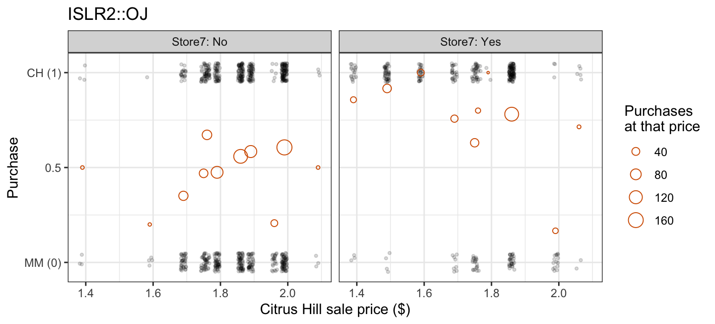
The open circles are the observed proportion of Citrus Hill purchases at each distinct price, sized by how many purchases were made at that price. Even before any model is fit, the raw correlation between price and purchase already changes sign from store to store: it runs from -0.24 at store 7 (higher prices, fewer Citrus Hill purchases, as expected) to 0.13 at store 2 (the opposite).
Fitting SalePriceCH + factor(StoreID) and SalePriceCH * factor(StoreID) puts both candidate models on the probability scale a price decision uses, with the observed proportions overlaid:
NoteCode
oj_additive    <- glm(Purchase ~ SalePriceCH + factor(StoreID),
                      data = OJ, family = "binomial")
oj_interaction <- glm(Purchase ~ SalePriceCH * factor(StoreID),
                      data = OJ, family = "binomial")

boa <- coef(oj_additive)
boi <- coef(oj_interaction)
store_ids <- sort(unique(OJ$StoreID))

# Each store's own observed price range, not the pooled range -- stores 3 and
# 4 were never sampled below $1.79, so a pooled grid would draw their fitted
# curves across prices those stores never charged.
oj_grid <- OJ |>
  group_by(StoreID) |>
  reframe(SalePriceCH = seq(min(SalePriceCH), max(SalePriceCH), length.out = 100))

oj_prob <- bind_rows(
  oj_grid |> mutate(Model = "Additive",
                    p_hat = predict(oj_additive, newdata = oj_grid,
                                    type = "response")),
  oj_grid |> mutate(Model = "Interaction",
                    p_hat = predict(oj_interaction, newdata = oj_grid,
                                    type = "response")))

store_colors <- c("#E69F00", "#56B4E9", "#009E73", "#0072B2", "#D55E00")

# The same shared-base idea, with the observed proportions as the layer every
# tab keeps.
oj_prob_base <- ggplot(mapping = aes(x = SalePriceCH, y = p_hat,
                                     color = factor(StoreID),
                                     linetype = factor(StoreID))) +
  geom_hline(yintercept = 0.5, color = "grey60", linewidth = 0.3) +
  geom_point(data = oj_rates, aes(y = rate, size = n, shape = factor(StoreID)),
             alpha = 0.8) +
  coord_cartesian(xlim = range(oj_grid$SalePriceCH), ylim = c(0, 1)) +
  scale_y_continuous(breaks = c(0, 0.5, 1)) +
  scale_size_area(max_size = 5) +
  scale_color_manual(values = store_colors) +
  labs(x = "Citrus Hill sale price ($)", y = "P(Purchase = CH)",
       color = "Store", linetype = "Store", shape = "Store",
       size = "Purchases\nat that price", title = "ISLR2::OJ")

oj_prob_data <- oj_prob_base

oj_prob_additive <- oj_prob_base +
  geom_line(data = filter(oj_prob, Model == "Additive"), linewidth = 0.9)

oj_prob_interaction <- oj_prob_base +
  geom_line(data = filter(oj_prob, Model == "Interaction"), linewidth = 0.9)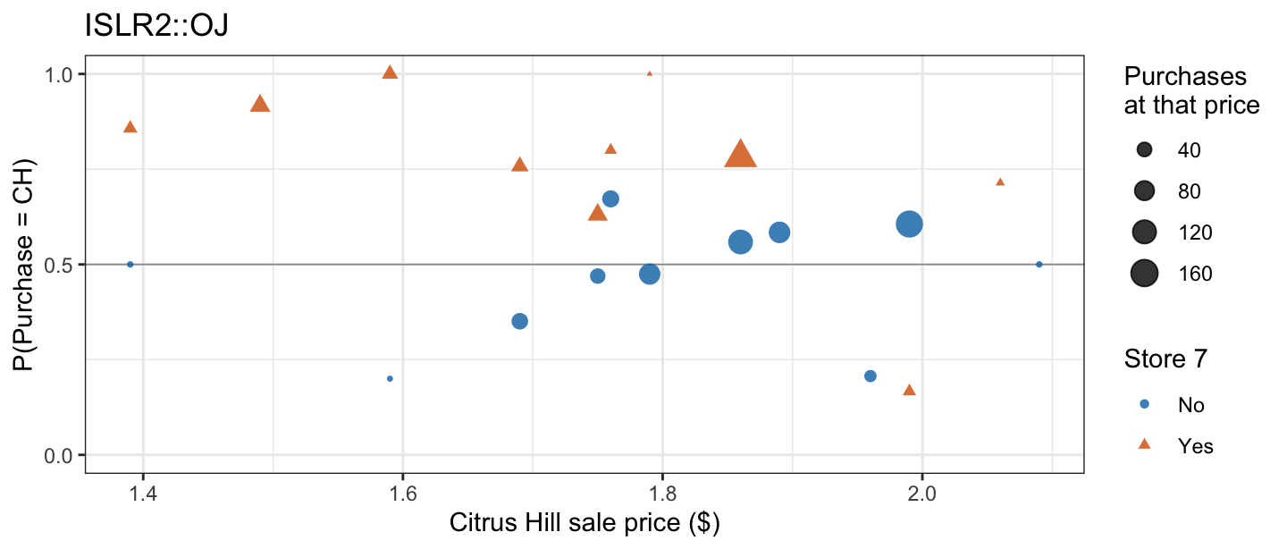
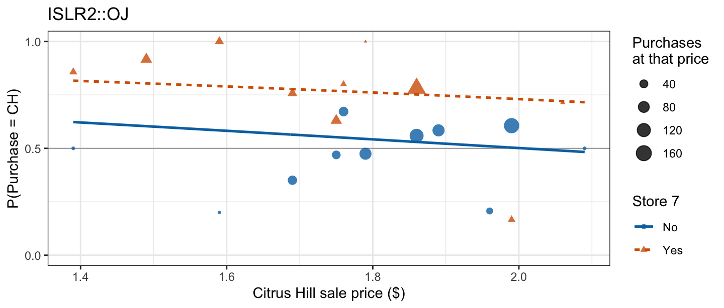
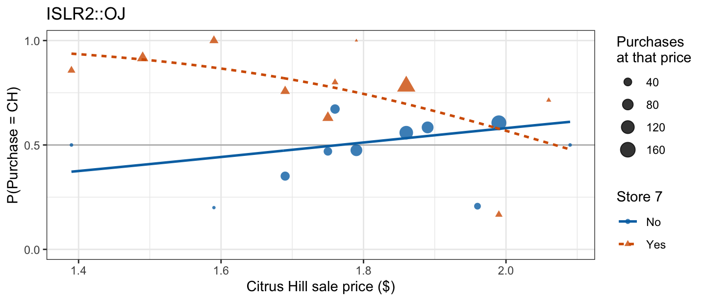
The data tab shows the observed proportion of Citrus Hill purchases at each price, by store. The additive tab fits them with 5 curves of identical shape that never cross, all drifting down with price. The interaction tab lets each store’s curve rise or fall at its own rate, and several now cross within the observed price range. Which of the two a store should predict from is the question the interaction test answers:
oj_dev <- anova(oj_additive, oj_interaction, test = "Chisq")
oj_dev
Analysis of Deviance Table
Model 1: Purchase ~ SalePriceCH + factor(StoreID)
Model 2: Purchase ~ SalePriceCH * factor(StoreID)
Resid. Df Resid. Dev Df Deviance Pr(>Chi)
1 1064 1299.7
2 1060 1276.3 4 23.373 0.0001067 ***
---
Signif. codes: 0 '***' 0.001 '**' 0.01 '*' 0.05 '.' 0.1 ' ' 1With 5 stores the interaction contributes 4 coefficients, one per non-reference store. Dropping all 4 of them at once would raise the deviance by \(G^2 = 23.37\) on \(4\) degrees of freedom, giving \(p = 1.07\times 10^{-4}\): price’s effect on the odds of a Citrus Hill purchase is not the same across stores, and the store-specific model is the one to predict from.
Reading each store’s slope off that model, and converting it to an odds ratio, makes the split concrete:
NoteCode
store_slope <- function(s) {
  if (s == store_ids[1]) return(unname(boi["SalePriceCH"]))
  term <- paste0("SalePriceCH:factor(StoreID)", s)
  unname(boi["SalePriceCH"] + boi[term])
}
store_slopes <- sapply(store_ids, store_slope)

oj_slope_vcov <- vcov(oj_interaction)
store_slope_se <- function(s) {
  if (s == store_ids[1]) {
    return(sqrt(oj_slope_vcov["SalePriceCH", "SalePriceCH"]))
  }
  term <- paste0("SalePriceCH:factor(StoreID)", s)
  sqrt(oj_slope_vcov["SalePriceCH", "SalePriceCH"] + oj_slope_vcov[term, term] +
       2 * oj_slope_vcov["SalePriceCH", term])
}
store_ses <- sapply(store_ids, store_slope_se)
store_z   <- store_slopes / store_ses
store_p   <- 2 * pnorm(-abs(store_z))
n_decisive     <- sum(store_p < 0.05)
decisive_store <- store_ids[which.max(abs(store_z))]

oj_slope_table <- tibble(
  store = store_ids,
  slope = store_slopes,
  or10  = exp(0.10 * store_slopes)
) |>
  mutate(slope = sprintf("%.3f", slope),
         or10  = sprintf("%.3f", or10)) |>
  knitr::kable(col.names = c("Store", "Slope (log-odds per \\$1)",
                             "Odds ratio per \\$0.10"),
               align = "ccc")

n_negative <- sum(store_slopes < 0)
n_positive <- sum(store_slopes > 0)| Store | Slope (log-odds per $1) | Odds ratio per $0.10 |
|---|---|---|
| 1 | -2.634 | 0.768 |
| 2 | 2.477 | 1.281 |
| 3 | 1.235 | 1.131 |
| 4 | 1.856 | 1.204 |
| 7 | -3.982 | 0.672 |
The fitted slopes run downward, the direction a price increase is expected to push demand, at 2 of the 5 stores; the other 3 run backwards, the same $0.10 raising the estimated odds. Only store 7’s slope is individually far enough from zero to rule out sampling error on its own (\(z = -4.35\), \(p = 1.36\times 10^{-5}\)); the other 4 point estimates are not — the drop-in-deviance test above is what supports “not all five slopes are the same,” not any one store’s estimate by itself. What these data cannot say is why the slopes that do run backwards do so — SalePriceCH records what was paid, not what else varied alongside it across stores and weeks, so the association it carries need not be the effect of price by itself.
Evaluating both models at $1.99, a price all 5 stores actually charged, turns those slopes into the number the question asked for:
NoteCode
oj_price <- 1.99
oj_pred_grid <- tibble(StoreID = store_ids, SalePriceCH = oj_price)

oj_pred <- oj_pred_grid |>
  mutate(additive    = predict(oj_additive, newdata = oj_pred_grid,
                               type = "response"),
         interaction = predict(oj_interaction, newdata = oj_pred_grid,
                               type = "response"))

oj_pred_gap <- max(abs(oj_pred$interaction - oj_pred$additive))

oj_pred_table <- oj_pred |>
  mutate(across(c(additive, interaction), \(x) sprintf("%.3f", x))) |>
  select(StoreID, additive, interaction) |>
  knitr::kable(col.names = c("Store", "Additive fit", "Interaction fit"),
align = "ccc")| Store | Additive fit | Interaction fit |
|---|---|---|
| 1 | 0.472 | 0.412 |
| 2 | 0.423 | 0.586 |
| 3 | 0.353 | 0.409 |
| 4 | 0.791 | 0.827 |
| 7 | 0.704 | 0.578 |
The two models disagree by as much as 0.16 in predicted probability at the same price and the same store — the difference between expecting a minority of customers to choose Citrus Hill and expecting a majority. Had the interaction test failed to reject, the two columns would have sat close together and the choice between the models would not have changed the number a store acts on.
A second number a price decision uses is the break-even price: the Citrus Hill price at which the model puts the two brands at 50/50, computed separately for each store. It is that store’s decision boundary for a \(0.5\) threshold — where its fitted log-odds crosses zero, \(\hat\eta = 0\), since \(\hat p = 0.5\) exactly there.
NoteCode
store_intercept <- function(s) {
  if (s == store_ids[1]) return(unname(boi["(Intercept)"]))
  term <- paste0("factor(StoreID)", s)
  unname(boi["(Intercept)"] + boi[term])
}
store_intercepts <- sapply(store_ids, store_intercept)
store_boundaries <- -store_intercepts / store_slopes

# Each store's own observed price range, not the pooled range -- store 7's
# break-even price, for instance, is inside the range OJ$SalePriceCH covers
# overall but above the highest price ever charged at store 7 specifically.
store_ranges <- OJ |>
  group_by(StoreID) |>
  summarize(lo = min(SalePriceCH), hi = max(SalePriceCH), .groups = "drop")

oj_boundary_table <- tibble(
  store = store_ids,
  price = store_boundaries
) |>
  left_join(store_ranges, by = c("store" = "StoreID")) |>
  mutate(observed = ifelse(price >= lo & price <= hi, "yes", "no"),
         price = sprintf("\\$%.2f", price)) |>
  select(store, price, observed) |>
  knitr::kable(col.names = c("Store", "Price where $\\hat p = 0.5$",
                             "In observed range?"),
               align = "ccc")

n_outside <- sum(store_boundaries < store_ranges$lo | store_boundaries > store_ranges$hi)| Store | Price where \(\hat p = 0.5\) | In observed range? |
|---|---|---|
| 1 | $1.85 | yes |
| 2 | $1.85 | yes |
| 3 | $2.29 | no |
| 4 | $1.15 | no |
| 7 | $2.07 | no |
3 of the 5 break-even prices fall outside the range of prices that store itself charged — a store whose own data never approached 50/50 can only place its break-even point by extrapolating past what was observed there, which is a property of the fitted line, not evidence about prices that store never charged.
NoteBeyond this course
Giving each store its own fixed intercept and slope, as the interaction model above does, spends one parameter per store and says nothing about a store that was not in the sample. A random effects (or mixed-effects) logistic regression instead treats the stores actually observed as a sample from a population of stores, and estimates the distribution of intercepts and slopes across that population rather than a separate fixed value for each one.
A random intercept model lets each store’s own intercept vary around a shared mean, \(b_{0,\text{store}} \stackrel{ind}{\sim} N(0, \sigma_0^2)\), while every store keeps the same price slope — the mixed-effects analogue of the additive model above. A random slope model goes further and lets the price slope itself vary by store, \(b_{1,\text{store}} \stackrel{ind}{\sim} N(0, \sigma_1^2)\), typically allowed to correlate with \(b_{0,\text{store}}\) — the analogue of the interaction model, but estimated with two variances and a correlation instead of one fixed coefficient per store, which matters far more once there are dozens of stores instead of five. In R, lme4::glmer() fits both:
lme4::glmer(Purchase ~ SalePriceCH + (1 | StoreID),
            data = OJ, family = "binomial")          # random intercept
lme4::glmer(Purchase ~ SalePriceCH + (SalePriceCH | StoreID),
            data = OJ, family = "binomial")          # random intercept and slope
Conclusion. A store predicting Citrus Hill purchases at a candidate price should predict from the store-specific model: the drop-in-deviance test rejects a common price slope decisively (\(p = 1.07\times 10^{-4}\)), and the two models’ predictions at $1.99 differ by up to 0.16. 2 of the 5 stores show the expected pattern of higher prices costing Citrus Hill sales and 3 run the opposite way, which these data describe without explaining; a prediction for a price far outside a store’s own observed range, its break-even price included, is an extrapolation of the fitted curve rather than evidence from that store.
11.4.3 Two questions, two verdicts
Both examples fit the same pair of models — one feature’s effect held common across groups, then allowed to vary — and both settled the choice with a drop-in-deviance test. What differed is what hung on the answer. For Default the answer was the result: \(\beta_3\) is the scientific quantity, and it is indistinguishable from zero, so the additive model of the previous lecture stands. For OJ the answer was a means to a number: the test rejects a common price slope, and the consequence is that a store’s predicted purchase probability at a candidate price moves by as much as 0.16 depending on which model supplies it.
Nothing about either pair of features announced which answer was coming. The additive assumption is checkable either way, and the reason to check it differs with the question: when the interest is understanding, the assumption is the question; when the interest is prediction, the assumption decides what number comes out.
11.5 Conclusion
Interactions, polynomials, and step functions are all choices of basis function entering the linear predictor as their own column, estimated by the same Bernoulli maximum likelihood as every other logistic regression, with every coefficient still read as a change in log-odds. An interaction lets one feature’s effect depend on another’s: categorical-categorical, adding an extra log-odds for the combination of two non-reference levels; continuous-categorical, giving each group its own log-odds slope and so its own odds ratio; continuous-continuous, letting one feature’s slope vary continuously with the other’s value. A coefficient’s raw magnitude never settles whether an interaction matters, since it depends on arbitrary units — only a \(z\)-test, for one coefficient, or a drop-in-deviance test, for several at once, does.
The diagnostic for the continuous-categorical case is a picture on the linear-predictor scale, where both fits are straight lines: if the interaction fit’s two lines are all but parallel, the additive model already captures each group’s log-odds slope; if they visibly cross or diverge, the slope changes from one group to the next. Each group’s decision boundary is where its own fitted line crosses zero, so an interaction moves the two boundaries independently rather than by a common shift.
Polynomials and step functions raise no new estimation or interpretation issues once basis functions are in view — only the question of how much flexibility the data can support, the same bias-variance tradeoff the flexibility lecture raised for a quantitative response. Adding columns to a binary-response model can also break the estimation itself in a way that least squares never breaks, a failure that goes by the name separation — the next lecture’s subject.